Rooted in energy, evolving into data
Rooted in energy, evolving into data
Rooted in energy, evolving into data
CLIENT:
CLIENT:
Gruppo Lazzari
Gruppo Lazzari
SERVICE:
SERVICE:
Brand identity
Brand identity
Brand identity
YEAR:
YEAR:
2025
2025
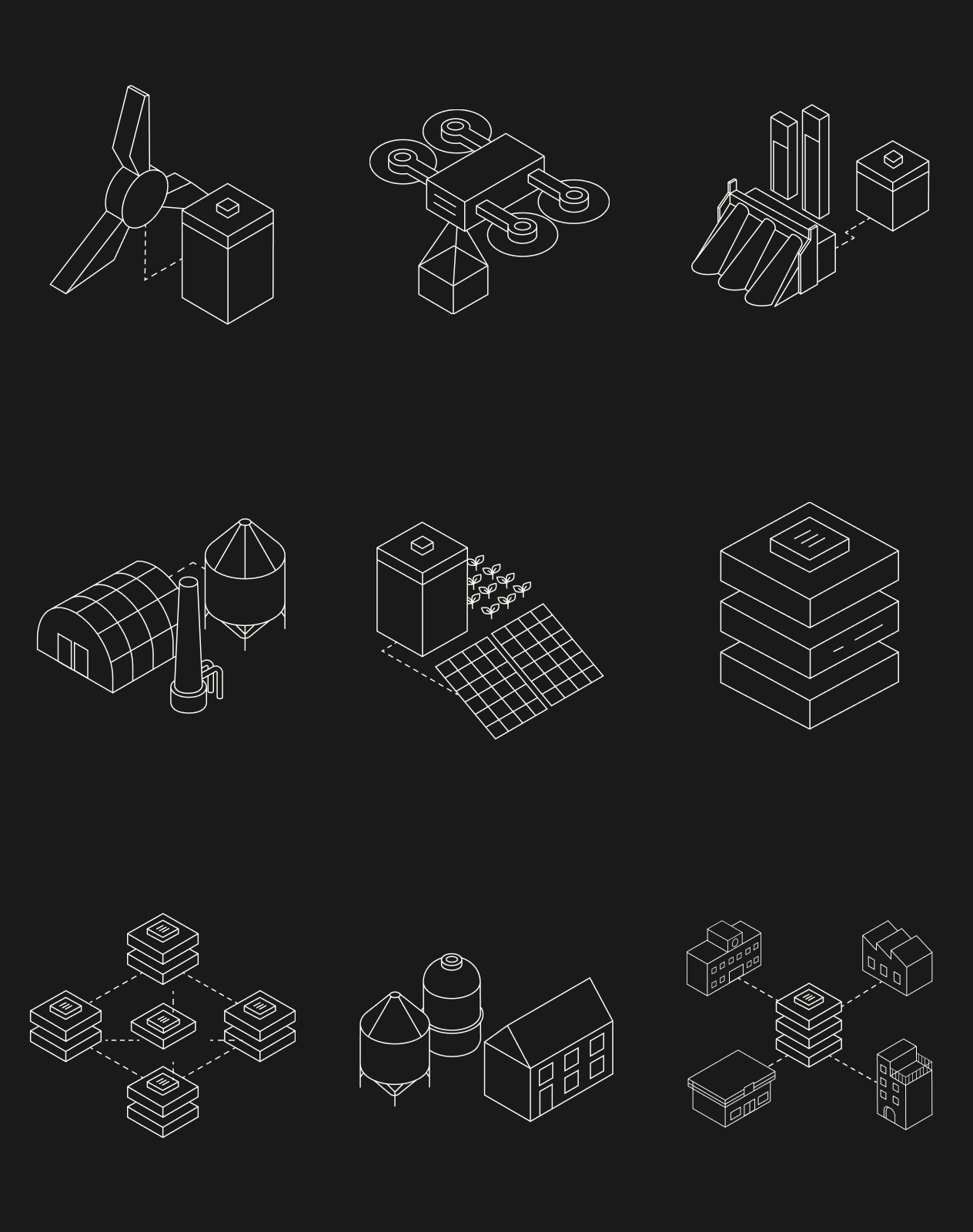
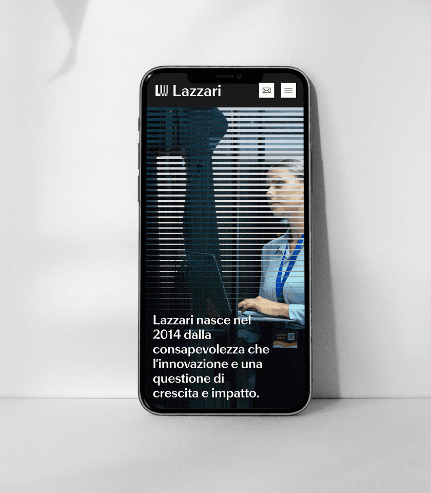
Data centers already account for roughly two percent of the world's electricity, and the rise of AI could double that demand by 2030. Behind the figures, a structural convergence is taking shape: renewable sources provide the flow, data provide the orchestration. With Gruppo Lazzari, a group built on more than ten years of experience in renewable energy and now expanding into data centers and digital infrastructure, we developed a new brand strategy and identity system designed to give a common form to its many souls — the energy heritage, the new digital ambition, the industrial know-how — under one recognizable group.
CHALLENGE
How do you give a unified identity to a group whose history lives in one industry and whose future runs across another? Lazzari sits at the intersection of two worlds that are converging on the ground but still speak different languages in the market. The challenge was threefold:
Build a single group identity that holds the renewable heritage and the digital ambition together, without flattening either one.
Make the move from renewables into data and digital infrastructure visible and credible to external stakeholders, while keeping it coherent with the group's history.
Strengthen the sense of belonging across companies and roles, reducing the fragmentation between subsidiaries and turning the group itself into a unifying narrative.
SOLUTION
We began with an observation found inside the client's own world: in a sector where the loudest players talk about scale and global platforms, Lazzari's advantage runs in the opposite direction. Its work is rooted in territories. Energy projects don't exist without the places that host them, and the same is becoming true of digital infrastructure: producing power close to where it is consumed, governing data close to where they are generated. The territory is not a backdrop: it is the unit of measure of the entire group.
From this insight, we built the strategic and creative architecture around a single positioning: a territory-first innovation platform that designs, builds and manages energy and digital infrastructure for enterprises, communities and stakeholders.
The work included:
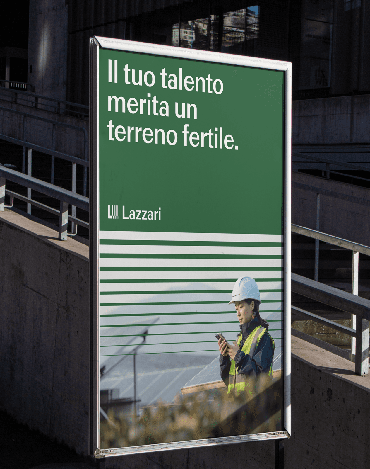
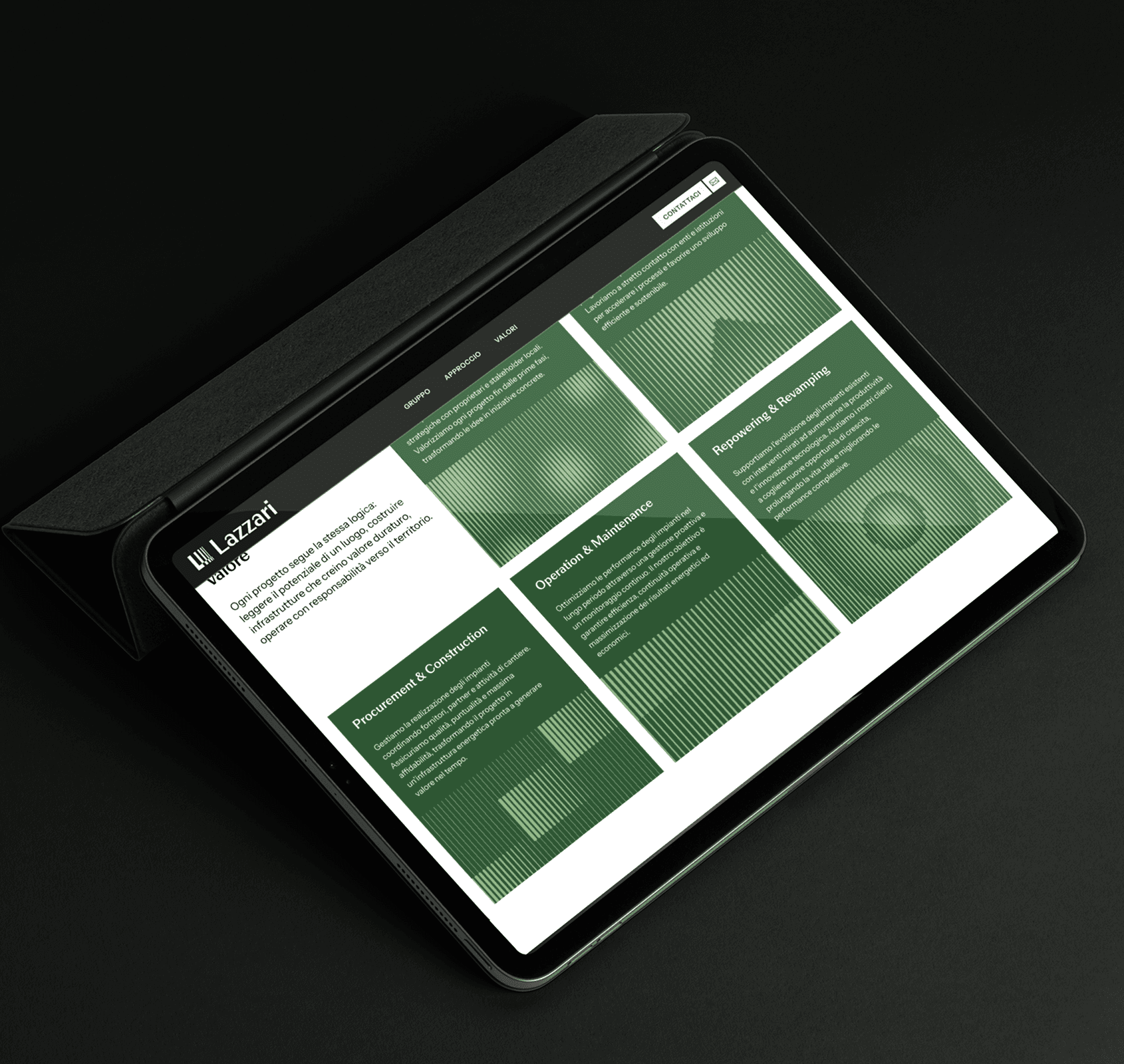
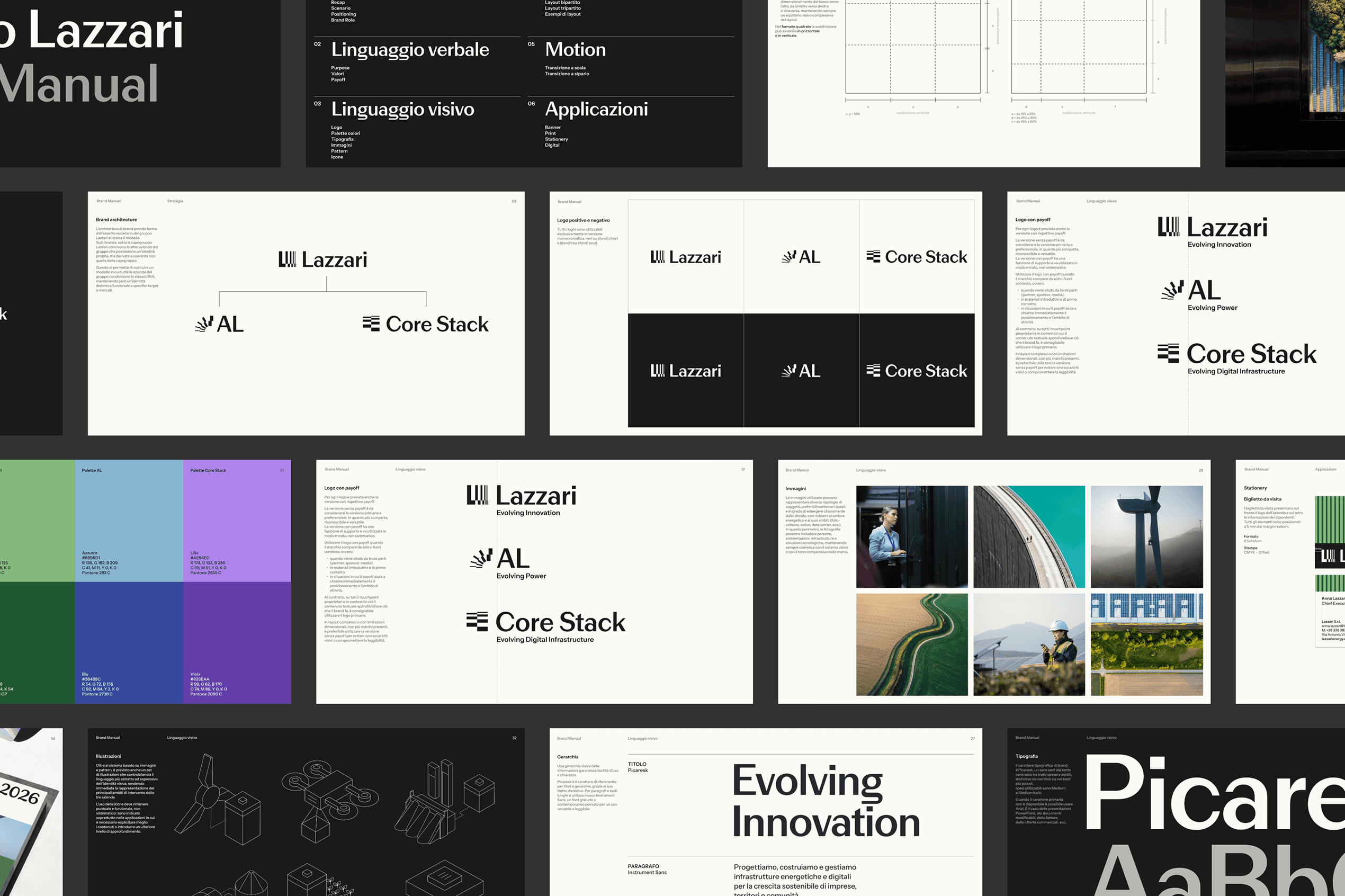
A sub-brands architecture. Under the holding Lazzari, each operating company keeps its own positioning, palette and personality, while sharing the same DNA.
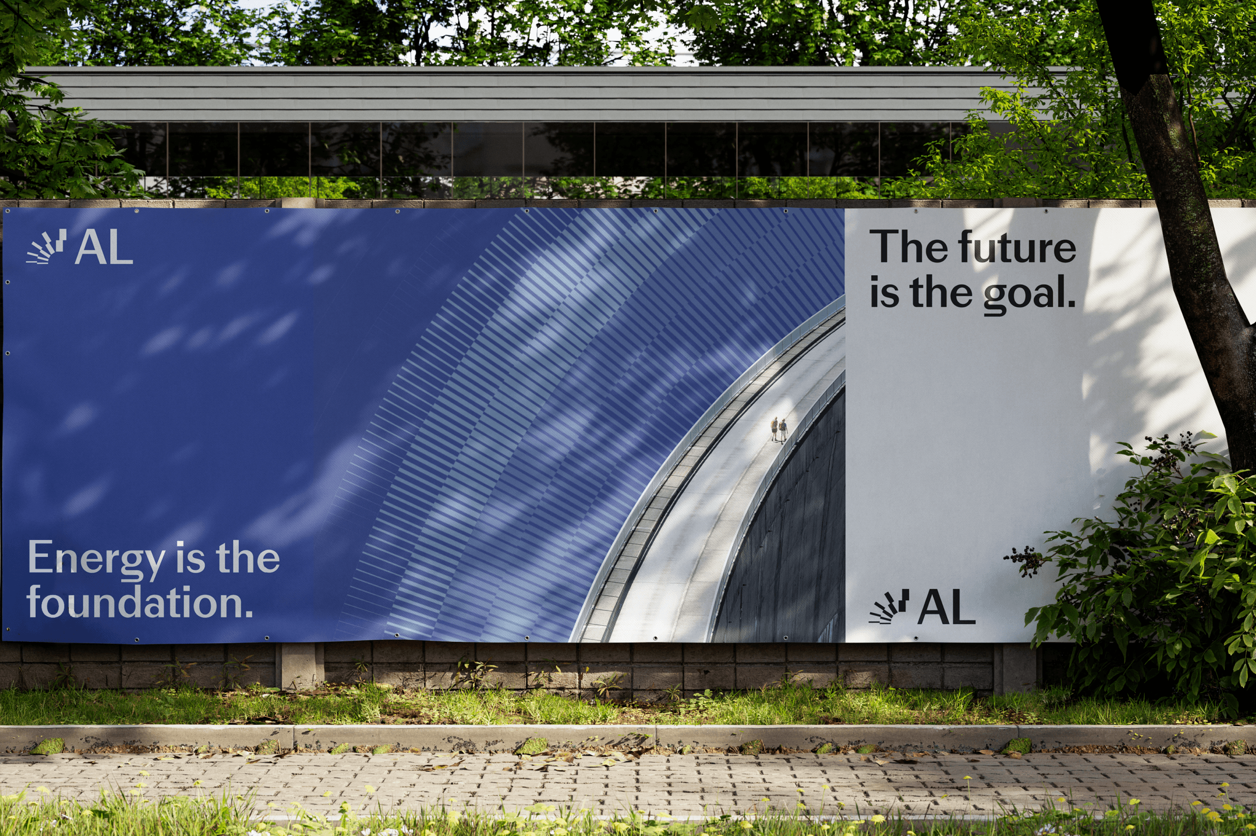
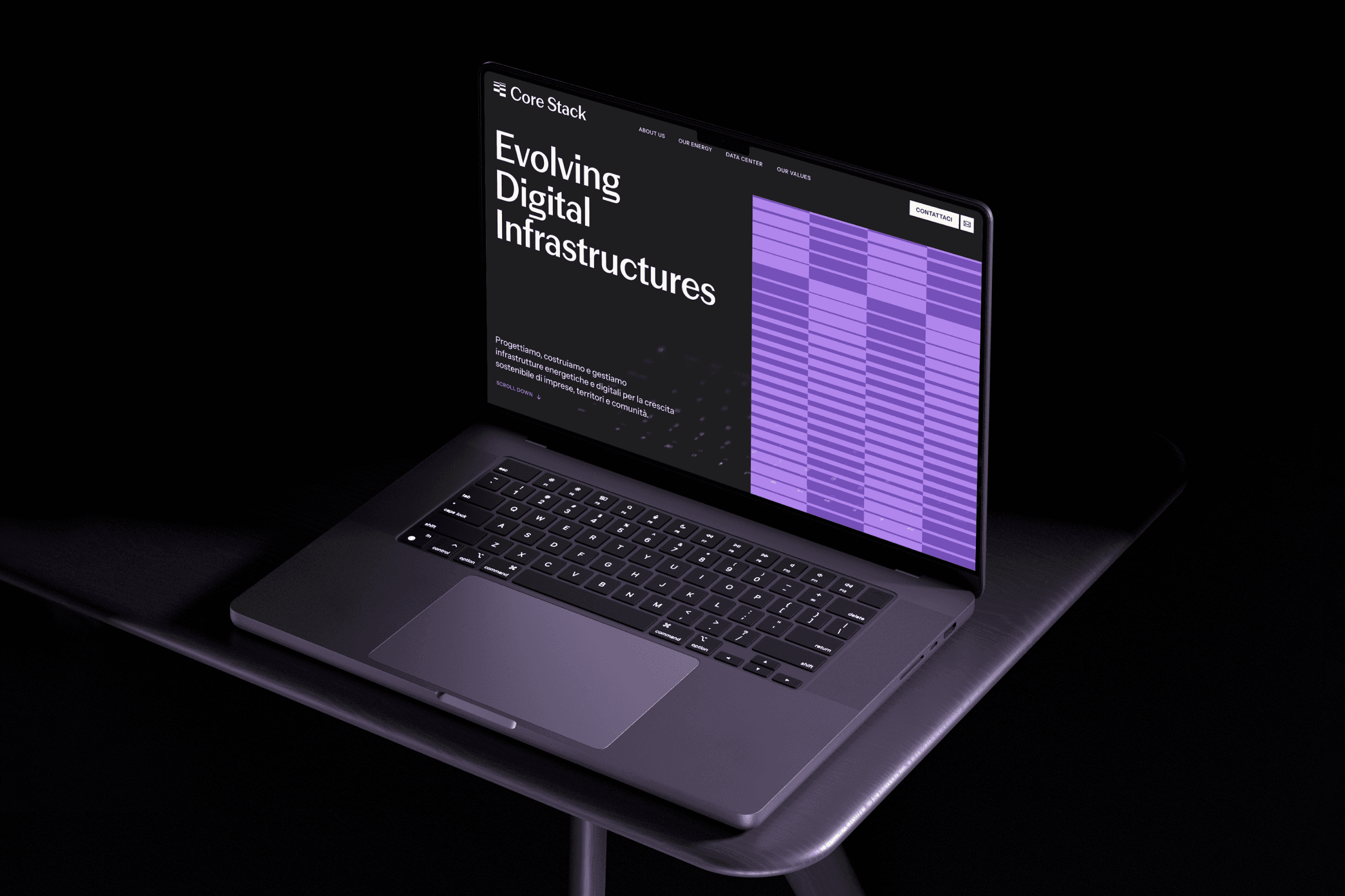
A verbal identity built on "Evolving". The payoff system — Evolving Innovation for Lazzari, Evolving Power for AL, Evolving Digital Infrastructures for Core Stack — captures a process in motion, not a finished point.
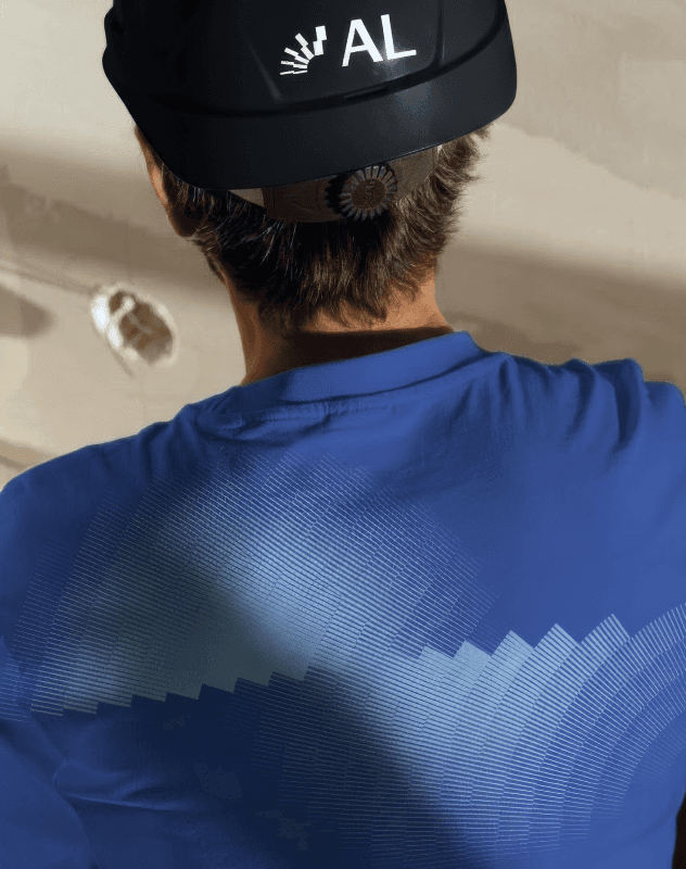
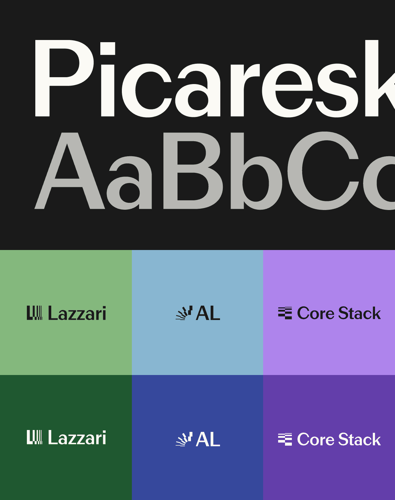
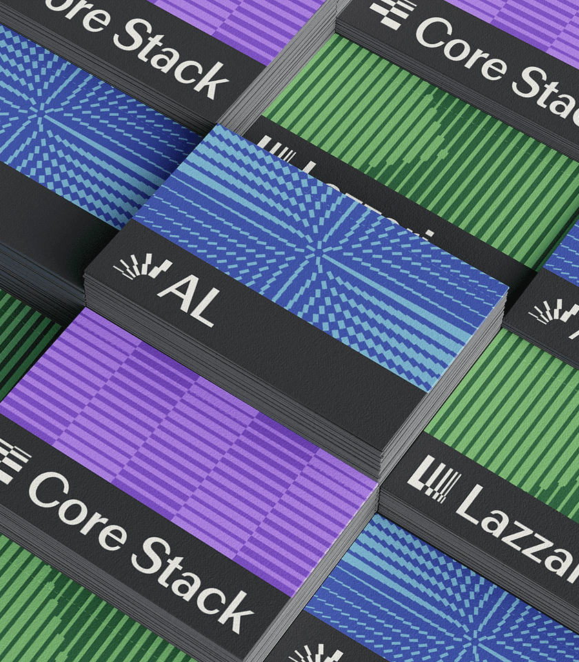
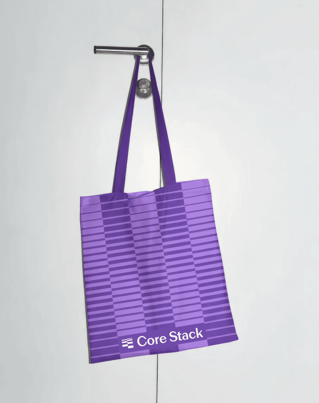
A visual identity system across three brands. Three pictograms, three palettes, one architecture. The Lazzari mark is a progressive L that suggests growth and impact. AL's radial composition reads as a sun or a wind turbine. Core Stack's stratified geometry recalls server stacks and data architecture. Each brand carries its own dual-tone palette — Lazzari green, AL blue, Core Stack purple — over a shared neutral base.
A typographic system. Picaresk anchors titles and hierarchies with its high-contrast stroke, while Instrument Sans handles long-form text with a contemporary, accessible voice.
A generative pattern tool. A dedicated web app turns images and gradients into segment-based patterns, with brand-specific orientations: vertical for Lazzari, radial for AL, horizontal for Core Stack. The result is a visual system that stays consistent across brands and adaptable across every touchpoint.
SOLUTION
We began with an observation found inside the client's own world: in a sector where the loudest players talk about scale and global platforms, Lazzari's advantage runs in the opposite direction. Its work is rooted in territories. Energy projects don't exist without the places that host them, and the same is becoming true of digital infrastructure: producing power close to where it is consumed, governing data close to where they are generated. The territory is not a backdrop: it is the unit of measure of the entire group.
From this insight, we built the strategic and creative architecture around a single positioning: a territory-first innovation platform that designs, builds and manages energy and digital infrastructure for enterprises, communities and stakeholders.
The work included:
A sub-brands architecture. Under the holding Lazzari, each operating company keeps its own positioning, palette and personality, while sharing the same DNA.
A verbal identity built on "Evolving". The payoff system — Evolving Innovation for Lazzari, Evolving Power for AL, Evolving Digital Infrastructures for Core Stack — captures a process in motion, not a finished point.
A visual identity system across three brands. Three pictograms, three palettes, one architecture. The Lazzari mark is a progressive L that suggests growth and impact. AL's radial composition reads as a sun or a wind turbine. Core Stack's stratified geometry recalls server stacks and data architecture. Each brand carries its own dual-tone palette — Lazzari green, AL blue, Core Stack purple — over a shared neutral base.
A typographic system. Picaresk anchors titles and hierarchies with its high-contrast stroke, while Instrument Sans handles long-form text with a contemporary, accessible voice.
A generative pattern tool. A dedicated web app turns images and gradients into segment-based patterns, with brand-specific orientations: vertical for Lazzari, radial for AL, horizontal for Core Stack. The result is a visual system that stays consistent across brands and adaptable across every touchpoint.


OTHER WORKS
S.2]

Wasa, Barilla Group
Wasa Global Website
Wasa, Barilla Group
Wasa Global Website
Wasa, Barilla Group
Wasa Global Website

A2A Life Company
A2A Design Language
A2A Life Company
A2A Design Language
A2A Life Company
A2A Design Language

RadiciGroup
RadiciGroup Website Design
RadiciGroup
RadiciGroup Website Design
RadiciGroup
RadiciGroup Website Design

Edenred Italia
App Edenred
Edenred Italia
App Edenred
Edenred Italia