
We talk about rights, memory and responsibility. And we do it starting from ourselves.
Hello! This is the I MILLE newsletter. It's called Forward because from here we try to look ahead (and also because if you like what we write, you can forward it to someone you like). Like you, over 1,700 other people working in the world of communication, marketing and digital read I MILLE Forward, and over 26,000 follow what we have to say on LinkedIn and Instagram.
I'm Ilaria Coletti, Strategist at I MILLE and I'm proud to be part of our Gender Equality Committee, "which led to the project I want to tell you about today".
An internal project designed to make us reflect on rights, time, memory, present and responsibility. It evolved into something concrete—an object, a collective gesture, a personal voice. In this issue, I'll take you behind the scenes and show you how it was born, what insight shaped it, and the challenges we faced bringing it to life.
The project, in a nutshell
Not By Birth is a project conceived by I MILLE's Gender Equality Committee to bring a more conscious perspective to what we often take for granted.
Born from internal dialogue, nourished by research, memory and reality, it took shape as a collective gesture. A small statement within our consultancy to address something that concerns each of us.
The project stems from an observation as simple as it is unsettling: many of the rights we take for granted today weren't born with us. They're recent victories, fragile, often younger than the people who work here.
From brief to insight
During a weekly Committee meeting, we felt the urge to leave something behind during our presentation at the internal I MILLE United event on May 23rd—something that could represent the commitment we carry forward every day to build a more conscious and inclusive company culture.
We wanted something beautiful to look at,easy to preserve, and with strong symbolic value.
Postcards seemed like the perfect format—analog objects in an increasingly digital world.
Once we settled on the format, we started working as we usually do on projects: gathering inspiration, building moodboards, seeking visual and cultural references.
Our first idea was historical memory: what if we created postcards celebrating fundamental victories for gender equality (and beyond) in our country? It seemed meaningful, aligned with the vintage aesthetic and imagery that postcards evoke. So we began searching for relevant dates, important laws, turning points. But then something unexpected happened.
We realized that many of these "historical victories" weren't so distant after all. Looking back just twenty, ten, five, or even a few years revealed a world less welcoming than the one we know and fight to make even more inclusive.
Here are some examples:
- We discovered that until 1975, a woman couldn't open a bank account without her husband's permission.
- Until 1990, homosexuality was considered a mental illness by the WHO.
- We had to wait until 1992 for Law 104, which protected people with disabilities.
- Stalking only became a crime in 2009.
- And also: equal pay between men and women has been law since 2010. I MILLE was founded in 2004.
This shift in perspective shook us. We applied this reasoning to our own lives. We thought we were people who came into the world already equipped with these rights. Instead, not only is this false, but many are victories closer to us than we'd realized. That's when we understood: we weren't talking about the past. We were talking about ourselves.
From insight to idea
The insight was powerful. Rights weren't born with us and aren't ours by birthright.
But how do you transform this power into a message strong enough for those who would receive the postcards?
"The most beautiful things in my life were never born from love but from anger," said Chiara Tagliaferri during one of the recent I MILLE Welcomes. A phrase that can be jarring at first impact, but captures the essence of this project. Because yes, this idea was also born from healthy form of anger. That anger you feel when you discover you've taken for granted something that was actually conquered with difficulty. That we were focusing so much on the future that we lost sight of our starting point. That so many things we proudly talk about today are the fruit of struggles we don't know well enough.
In our anger, we started relating every conquered right to ourselves, our male and female colleagues: "Do you realize that Gaia was born before stalking became a crime?" "Do you realize that Matteo was born before honor killings and shotgun marriages were abolished?"
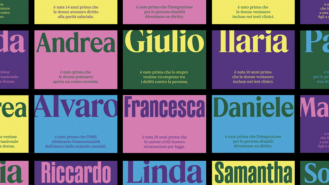
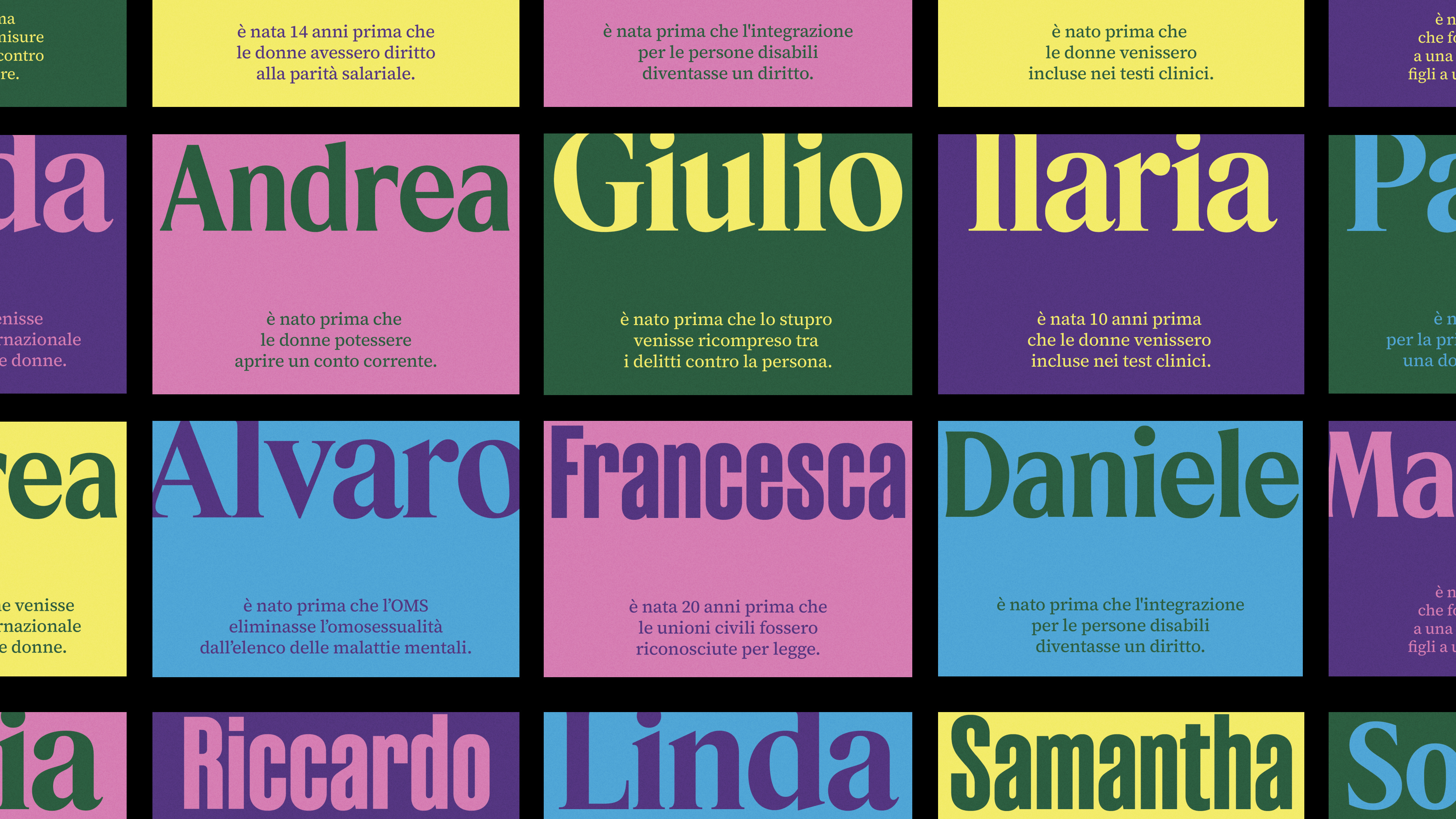
This is where the idea took shape: a postcard for each colleague, with their own name and an uncomfortable, personal, current truth. A direct and engaging way to transform a collective message into something intimate. Something to keep, reread, not forget.
On the front, the name accompanied by the event or right acquired after that person's birth.
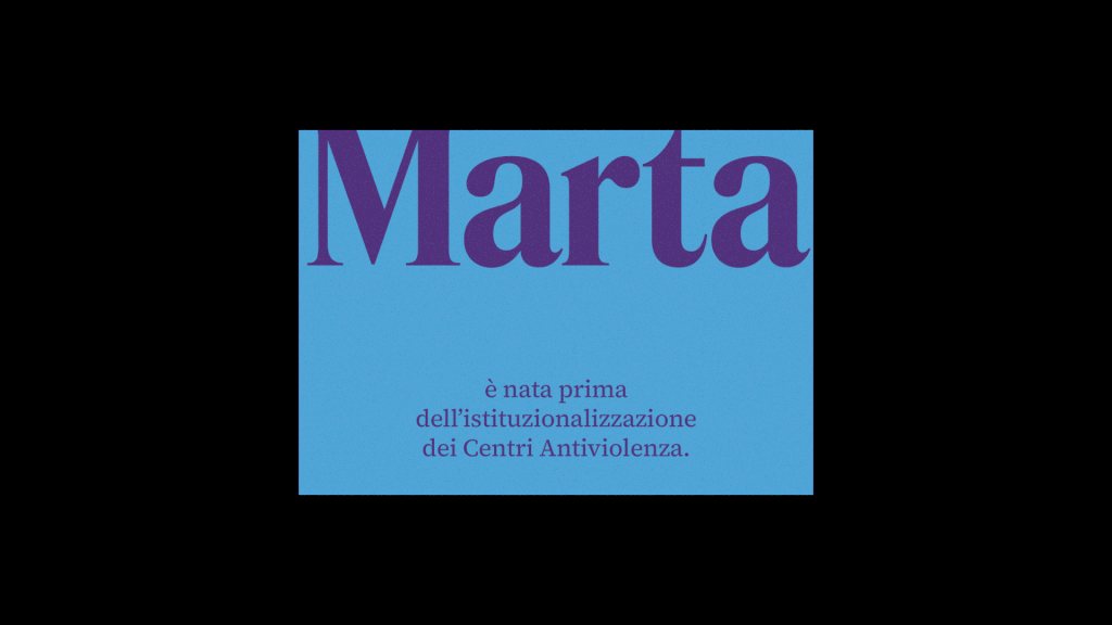
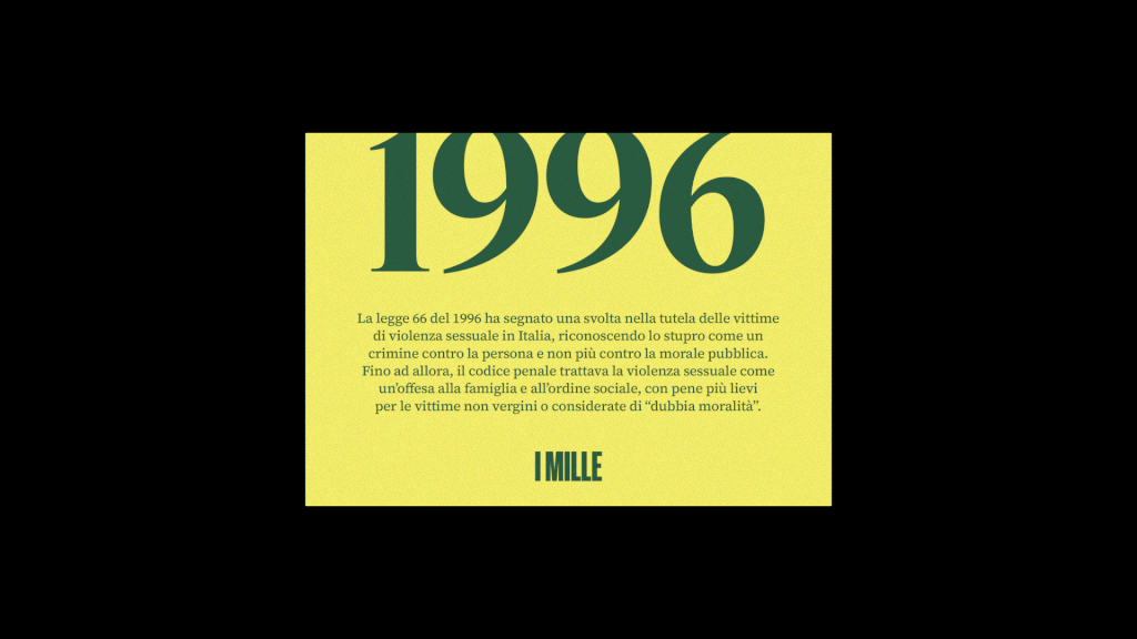
On the back, the reference year and a brief explanation of the context.
From idea to execution
Once we defined the insight and found a form that could convey its strength, came the most demanding part: making everything actually work. Because in theory it's all beautiful, but then you move to practice.
We had 100+ postcards to create. We wanted each postcard to be unique, but at the same time part of a coherent visual system. A personal object, but one that told a collective vision.
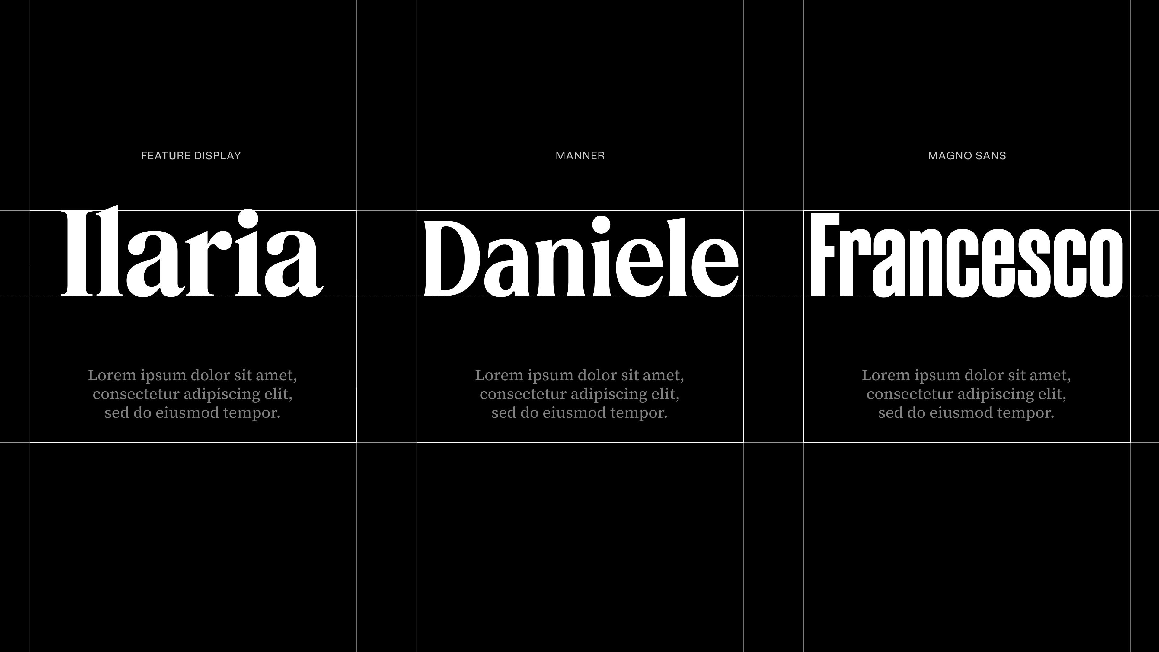
Challenge #1 - Name lengths
The first problem is that we have names of very different lengths: Maria Vittoria, Francesca and Riccardo don't occupy the same space within the layout as Marco, Sara and Silvia.
Short names tended to get lost in the space, long ones compressed until almost illegible, creating larger or smaller encumbrances and, consequently, unbalanced postcards. We couldn't afford a system that penalized those with longer names, nor did we want different solutions for each case: we would have compromised the entire project's coherence.
So we chose a single layout for everyone. And to adapt names of different lengths and shapes without losing harmony, we worked on a modular typographic system: three fonts, designed to occupy the same visual space even with different numbers of letters. An invisible but fundamental balance, to speak the same way to every colleague, giving each name the same dignity and graphic weight.
The three fonts were selected not only to meet a technical need, but also to visually reinforce the project's message. Three typefaces, three distinct but coherent graphic voices, each capable of adapting to different lengths without losing tension, readability, harmony.
- For short names like Gaia, Silvia, Ilaria we chose Feature Display, a serif font with strong personality and characteristics (like contrast and serifs) that give it dynamic, almost restless tension. It's a font that isn't content being decorative, but demands attention. We chose it because it perfectly captures that sense of urgency and immediacy the project wants to evoke.
- Manner for medium names like Assunta, Daniele, Virginia. It's a sans-serif inspired by Swiss modernism, but with a warm, almost empathetic touch. Its design is precise but never cold, and this dual nature, between rationality and humanity, makes it an authoritative but accessible typeface, capable of communicating clearly without raising its voice.
- Finally, we chose Magno Sans for long names like Maria Vittoria, Alessandro, Massimiliano. It's an elegant geometric font that unites clean rational proportions with gestural and refined details. In its condensed version, it allowed us to accommodate very long names without sacrificing readability or impact. Magno Sans is a font that knows how to occupy little space with great presence, keeping the message intact.
Challenge #2 – Text lengths
The second difficulty concerned the texts: both on the front and back of the postcard, we needed to communicate directly and powerfully, while respecting the rigid spaces imposed by the layout. The texts had to be brief, incisive, perfectly readable.
Above all, they had to be precise—you don't mess around with rights. No approximations, no ambiguity: every word had to be chosen with millimetric care, every synthesis had to restore the strength and exactness of the original message, without risking inconsistencies and without betraying the normative substance.
Reducing without trivializing, condensing without sacrificing rigor: it was a real editorial challenge but allowed us to keep intact the value and credibility of what we wanted to communicate.
Challenge #3 - Color palette
The color choice also tested us: we sought a brilliant, vibrant palette, capable of attracting attention and best representing the project's spirit.
But the transition from RGB to CMYK—anyone who works with printing knows—is always a leap in the dark: what shines on screen often dims on paper, contrasts disappear, and with them part of the message's strength.
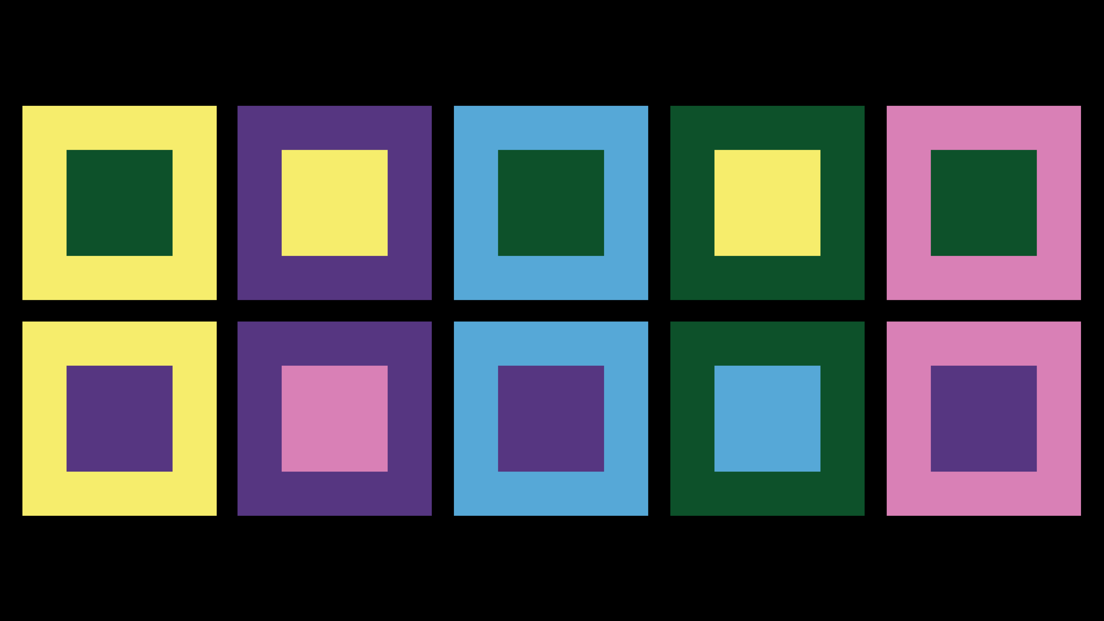
We did numerous print tests to find balance between intensity, readability and coherence. In the end, we selected five main colors, balanced among themselves for saturation and brightness: yellow, purple, blue, green, pink.
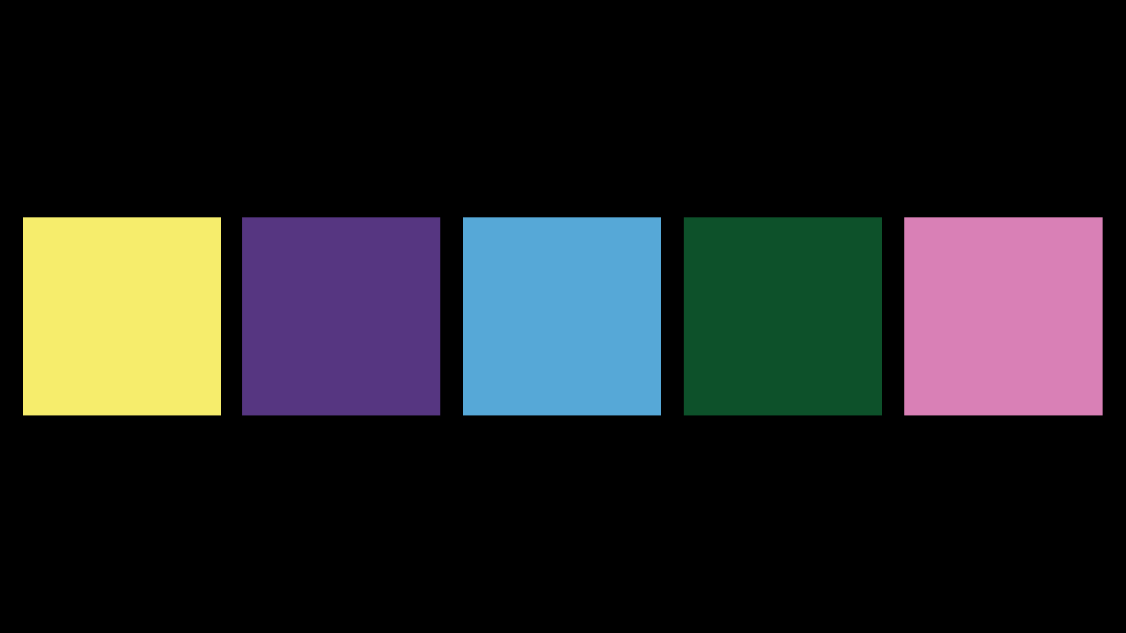
We then combined them to obtain ten different chromatic combinations: all brilliant, all readable, all in harmony.
Challenge #4 - The delivery
Once the postcards were printed, we faced one last challenge: how to tell our colleagues about the project without ruining the surprise effect, keeping the message's strength intact?
We needed something clear but impactful, capable of explaining the operation's meaning without anticipating too much. So we translated the idea into a presentation and video case designed to strike, move and accompany the postcards' delivery with the same intensity with which we had imagined them.
Receive, preserve, forward
Not By Birth was born as an internal project, but from the start we realized it also spoke beyond us. That it's not just a company issue, or gender issue, or design issue. It's a matter of awareness. Of memory. And responsibility.
Because rights aren't guaranteed forever.
They're the result of courage, commitment, and the efforts of those who came before us.
And today it's up to us to decide how to continue defending them.
This newsletter is our way of sharing a piece of this journey.
If it resonated with you, made you reflect or sparked a question, forward it to someone.
And if you want to talk about it with us, you'll always find us where we're at our best: in dialogue.
