
On the case of Venezia FC, and how it became a cultural stronghold
Introduction
Venice is where I was born. A city forever attached to the phrase, “It’s beautiful, but I wouldn’t live there.”
As if that contradiction were part of its DNA.
As if our modern lives had made us so lazy we’ve come to believe that comfort can replace beauty.
And yet, that’s a trap many of us have fallen into — myself included.
Partly, I’ll take the blame. But I’m also convinced it’s not mine alone. Because Venice, day by day, looks less and less like the city I used to know. Every time I go back (now that I’ve surrendered to the convenience of Milan) I find it a little more unwelcoming, a little more crowded, a little more like a theme park.
With over 13 million overnight stays a year and 100,000 daily visitors during peak season, Venice is now the second most visited city in Italy, after Rome. And if we cut through the rhetoric that says tourism only brings value, what remains is a hollowed-out city whose historic center counts barely 48,000 residents.
If you’ve heard about Venice in recent years, it was probably framed as the city of overtourism: the city with an entry ticket, billionaire weddings like Jeff Bezos’s, one-way alleys and apartments turned into Airbnbs.
None of that is wrong. Venice is one of the clearest examples of a city taken away from its inhabitants and turned into a playground for outsiders.
But that’s not the whole story.
Today, I want to show how a football club has managed to offer a credible alternative to that narrative and how, through branding, it’s given voice and space back to a Venice that still exists, and is worth listening to.
If you know me, you might wonder whether I’m the right person to talk about a football brand.
If you don’t, let’s clear that up right away: I don’t follow football. I barely understand the rules (though I do know what ‘offside’ means), and I’ve been to a stadium exactly once.
So if you’re tempted to close this tab right now, just bear with me.
Because precisely for that reason, I might be the right person to tell this story: the Venezia FC brand matters even if you couldn’t care less about football.
Let’s dive in.
A bit of context
Founded in 1907, Venezia FC’s story is deeply intertwined with that of its city.
After decades bouncing between lower leagues and Serie A, the team now plays in Serie B, but it has become an international case study, not for its sporting results, but for its visual, cultural, and brand identity.
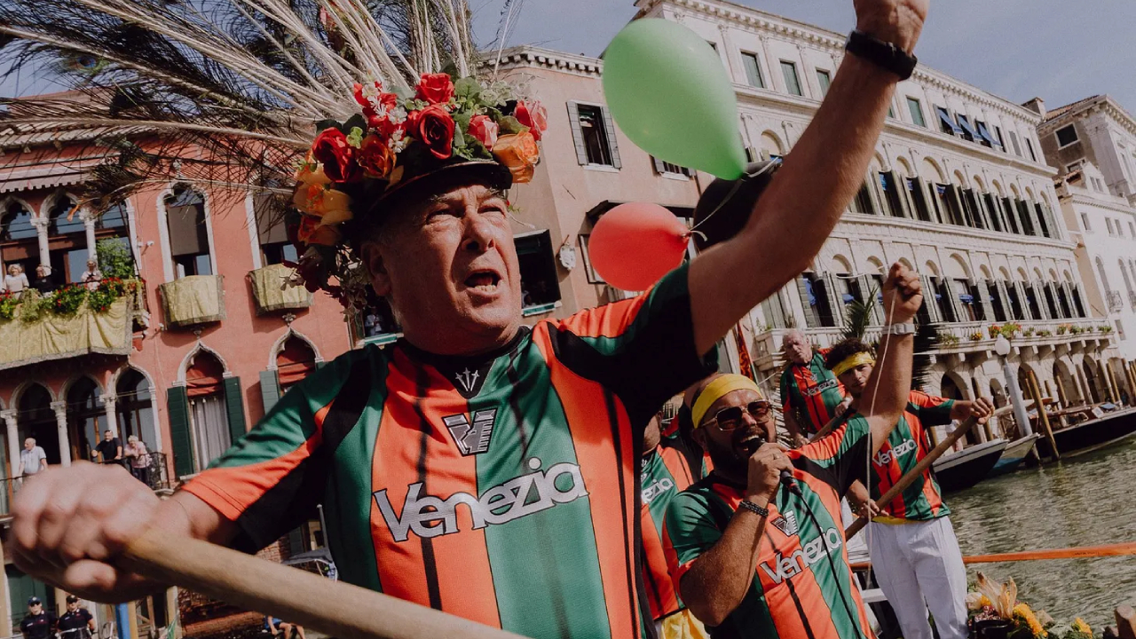
In a city increasingly alienated from its residents, the club does the opposite: it brings them back to the center. Even if you’re not into football, it’s hard not to see in this team a cultural stronghold, a form of urban resistance that gives back meaning, voice, and presence to a city too often reduced to a spectacle.
Its message to the world is clear: Venice is not a postcard cliché or a tourist funnel. Venice is a living city made of people, and fans.
How do you build a narrative that strong?
If you love football, you’ve already seen it. If you work in marketing or design, you’ve probably crossed paths with it. But if this brand is new to you, go take a look at Venezia FC’s Instagram before reading on. At first glance — even to an untrained eye — one thing stands out: nothing is random. Every detail serves a clear narrative, crafted with coherence, precision, and purpose.
Let’s look at a few examples.
1. The symbols
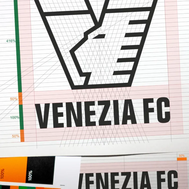
At the heart of the 2022 rebrand by the German studio Bureau Borsche was a bold idea: reclaim the city’s symbols, not as decorative clichés for tourists, but as living cultural codes for its community. It all began with the logo.
Minimal, geometric, and rich with meaning, it reinterprets the Lion of Saint Mark (the city’s emblem and the club’s icon) within a stylized “V”. The lion’s wings echo the six-pronged ferro of a gondola, symbolizing Venice’s six sestieri (districts). The gold tones recall the club’s heritage, bridging past and future, memory and modernity. It’s more than just a simple design refresh, it’s a cultural statement. Venezia FC doesn’t use the city’s symbols for show but rather honors them, reshaping them with contemporary depth and respect.

2. The kits
If you’ve ever heard of Venezia FC, it was probably because of their jerseys. Meticulously designed, widely celebrated beyond the pitch, they’ve become cult objects across football, fashion and design circles.
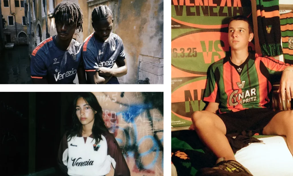
The Home Kit 25/26 pays homage to Venice as a crossroads of cultures. Its black base is crossed by patterns evoking 15th-century maps, when Venice was a global hub of trade and art. Orange-green stripes cascade from shoulders to hem, echoing the club’s traditional palette, while the rounded semi-serif typography draws inspiration from Venetian architecture.
The Away Kit 25/26 channels 1990s nostalgia through the city’s historical lens: a cream tone reminiscent of Istrian stone, with burgundy gradient sleeves inspired by Venetian silks and Renaissance painters like Titian and Veronese. Elegant, tactile, refined.
The Third Kit celebrates unity and belonging: vertical stripes, bold and timeless, reinterpreted for a contemporary audience.
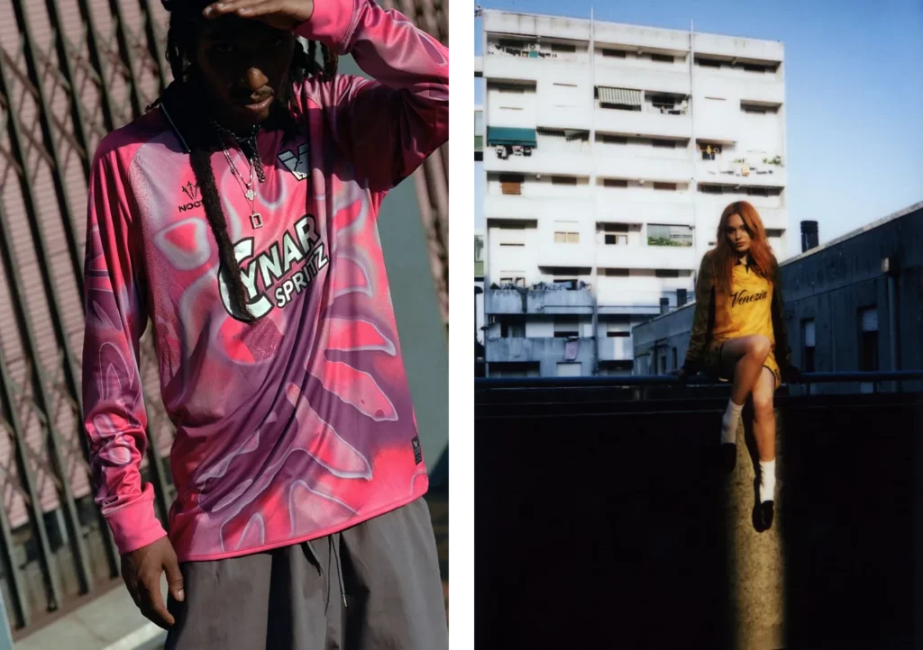
And then, the Goalkeeper Kits: gold like the lagoon’s sunset, fuchsia like its vibrant nightlife, laced with calligraphic details and cosmic motifs.
Every shirt tells a story.
But the real narrative leap happens in how they’re presented.
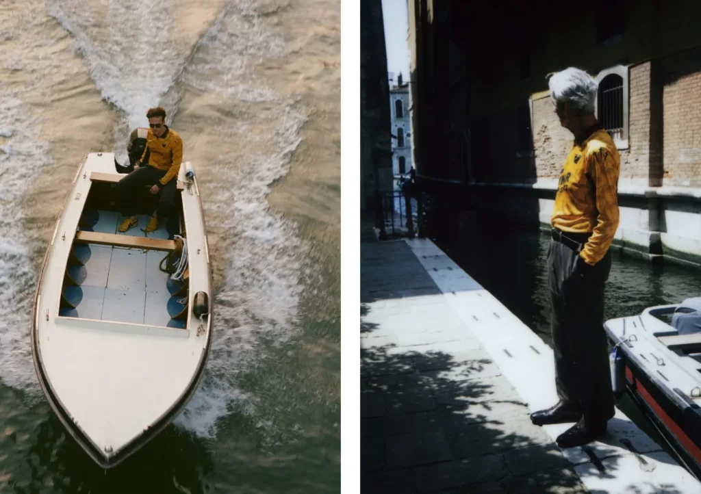
The photo campaigns take place in alleys, squares, and lagoons. Starring, locals: fishermen, artisans, kids, boaters. No glossy models, no filters. Just the raw, melancholic, living Venice that tourists rarely see.
Even the collaborations are deliberate: for the second year in a row, Venezia FC teamed up with Nocta, Drake’s streetwear line, bridging football, culture, and global fashion. It’s a masterclass in brand positioning: speaking to everyone doesn’t mean pandering to tourists, but doing what great cultural brands do: exploring new territories, blending disciplines and creating identity.
3. The visual identity
Venezia FC’s visual system is where design, culture and belonging truly merge. What’s striking is the discipline with which it’s carried forward, regardless of the team’s sporting ups and downs. The rebrand happened right after the club’s relegation, and yet, the identity remained strong, consistent, unwavering.
This isn’t a brand built on victories. It’s built on meaning, offering fans a reason to belong that goes beyond football.
The style draws from Swiss modernism: clean layouts, modular geometry, and harmony between structure and emotion.
It mirrors the city’s own architecture: rhythmic, symmetrical, balanced.
The club’s colors (green, orange, and black, with the return of gold) are treated as flags of identity, not decoration. They are powerful, symbolic and unmistakable. Venezia FC succeeds where few sports brands dare to go: blending audacity and tradition, local pride and global relevance.
It speaks fluently to three audiences:
- To the world, through the universal codes of design and streetwear.
- To the city, as a badge of identity and pride.
- To its fans, as custodians of its soul.
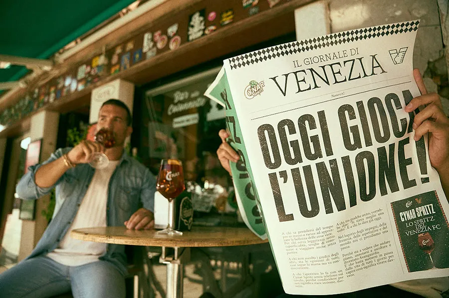
4. The sponsors
Even the choice of sponsors tells a coherent story. While most clubs chase global logos, Venezia FC chose the opposite path, collaborating exclusively with local brands.
From Cynar, the historic Venetian bitter, to Becher, a traditional deli brand (whose name means “butcher” in dialect); from Murano’s glassmakers to city museums and cultural institutions, every name on the shirt is part of Venice’s living fabric. Storytelling trumps sponsorship: each logo is a fragment of community, each partnership a statement of belonging.

Conclusion
While the real city struggles under the weight of crowds, entry tickets, and commodification, Venezia FC restores depth and dignity to its local identity. It shows that another Venice is possible, one that’s lived, crafted and creative. A city that still makes meaning. Every element of this brand has been designed to make Venezia FC a cultural brand, not just a sports one.
That’s how it’s become, as someone once said, “the coolest football team in the world”.
And perhaps precisely because it never needed to win to get there.
