Edenred
Designed for Everyday
Client
Edenred Italia
Industry
Business Solutions
Disciplines
Digital Product Design
Motion Design
UX Writing
In a world where digital experiences shape how we interact with services, Edenred Italia saw an opportunity to go beyond functionality. The challenge was to redefine how people use them, making each experience as seamless, intuitive, and accessible as possible.
CHALLENGE
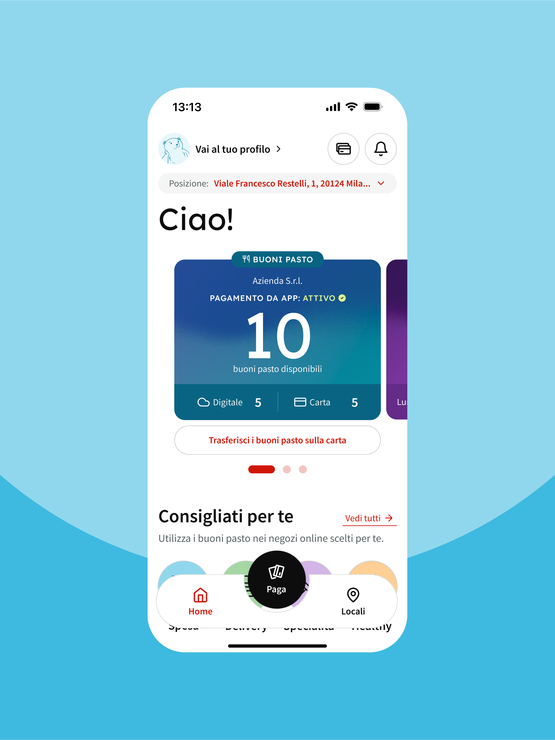
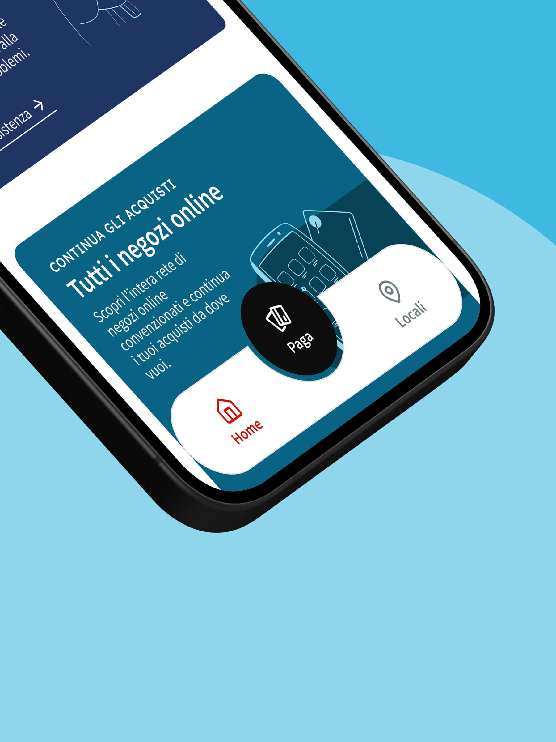
Edenred Italia wanted to improve their most used app, a reference point for the lunch break of millions of workers. The goal was to integrate multiple functionalities into a single platform, while maintaining simplicity of use, clarity and speed.
At the same time, there was a need to evolve the existing UI library into a full design system – flexible, scalable, and usable across different teams and products – ensuring consistency and integrity across all digital touchpoints. The new experience also needed to reflect Edenred’s commitment to Inclusive user excellence.
RESULT
We started with people. Through data-driven research and in-depth analysis of user behavior, we mapped key functionalities, pain points and usage patterns. This allowed us to redesign the information architecture from the ground up-cutting through complexity to deliver a logical and intuitive navigation flow.
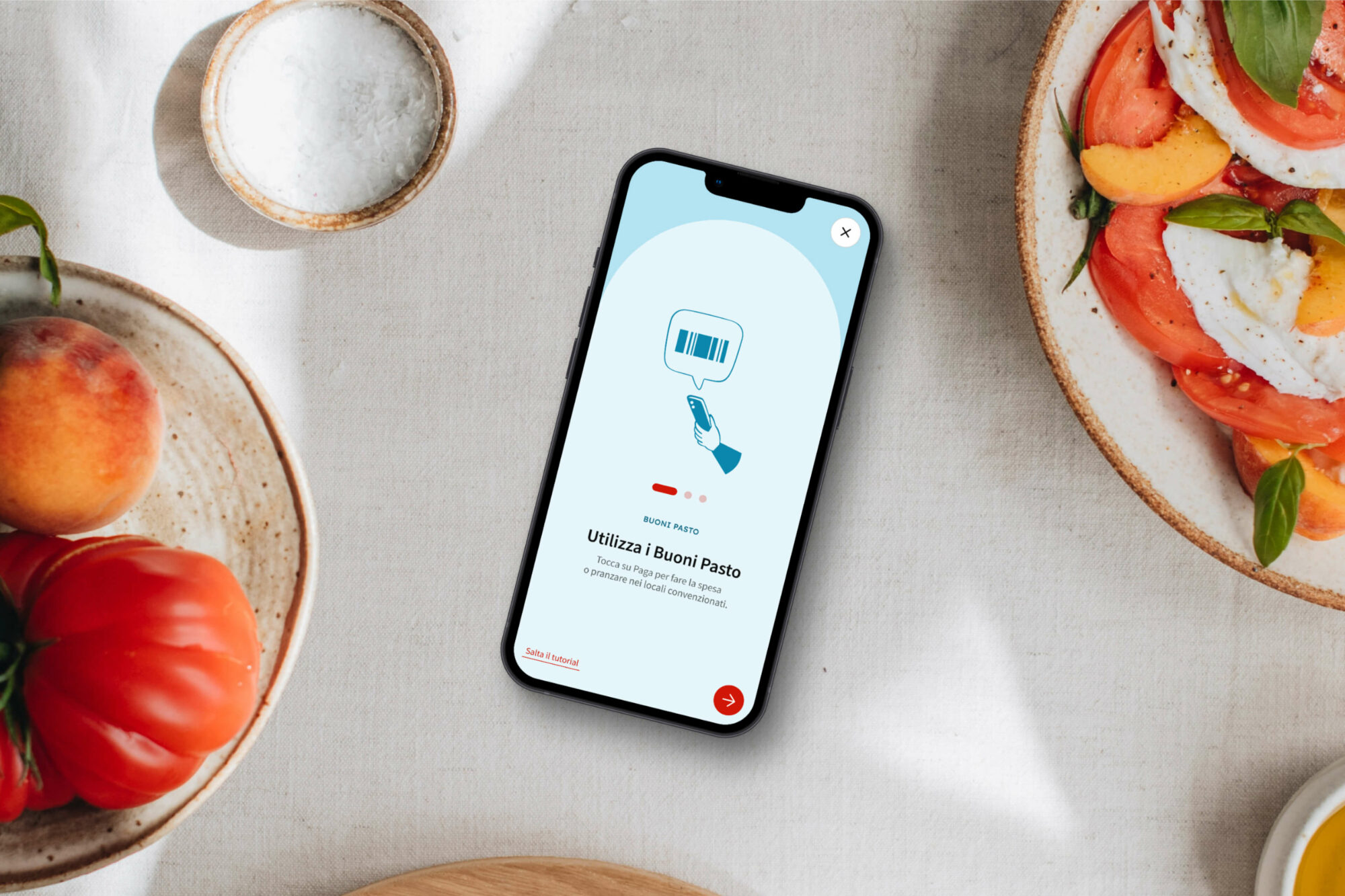
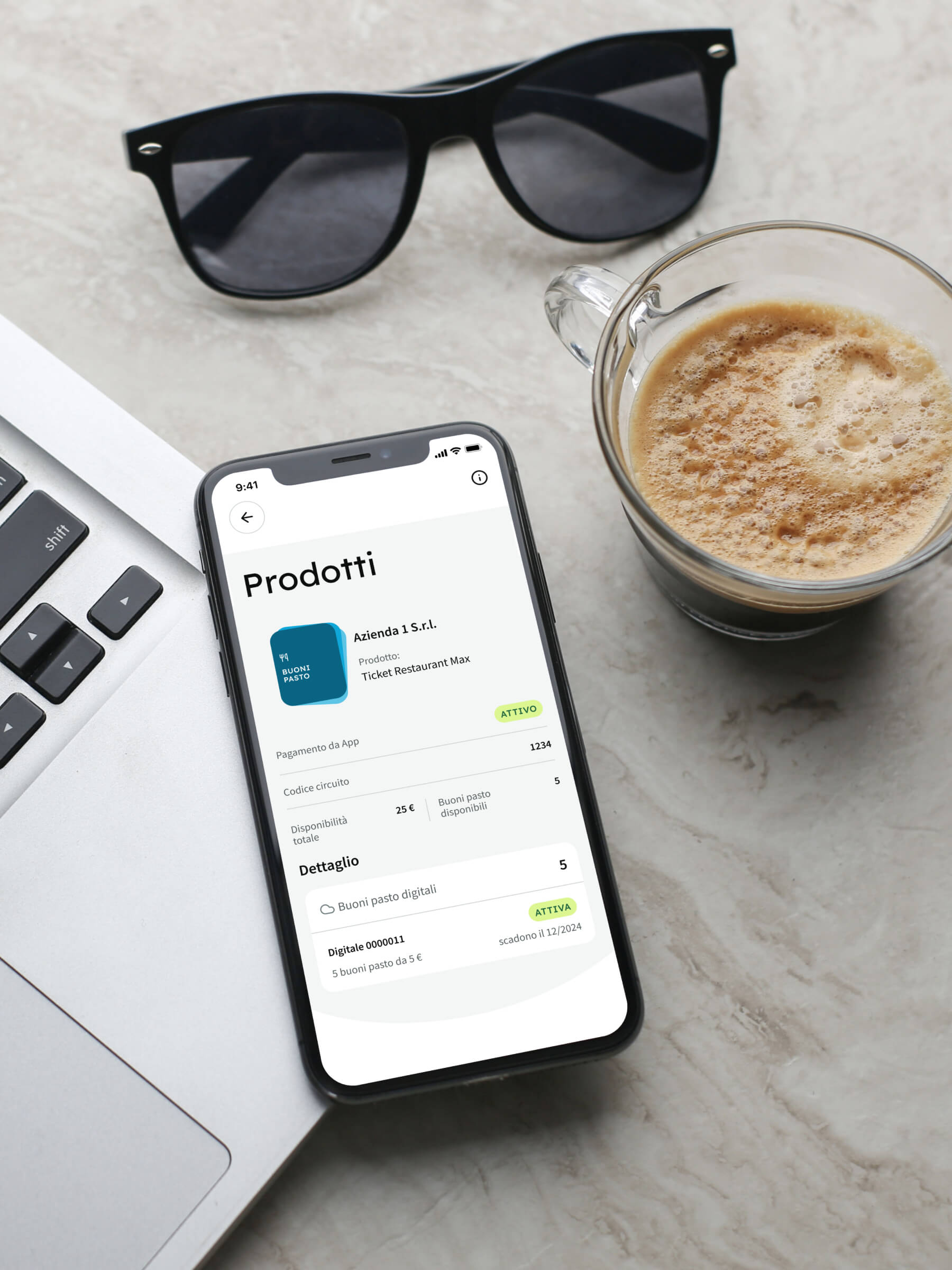
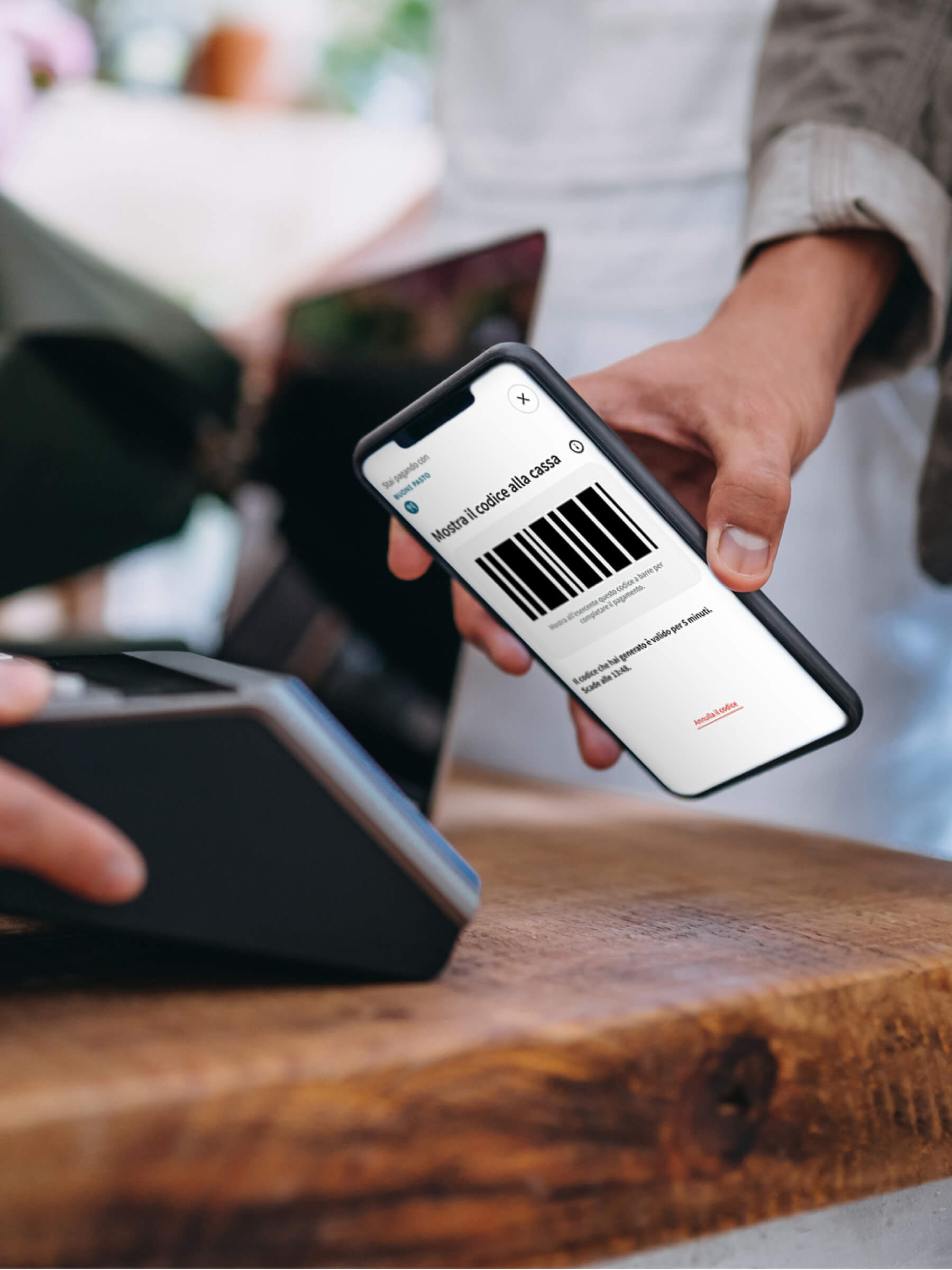
Surface simplicity required behind-the-scenes complexity. Every screen, action, and interaction was thoughtfully refined to provide users with a smooth, familiar experience – making the app pleasant to open, easy to use and quick to understand.
From color contrast ratios and touch target sizing to gender-neutral language and clear copy, every detail was considered to ensure accessibility for all. We prioritized clarity across interface elements, gestures, and user feedback.
Here's what we delivered, together with Edenred Italia’s team:
- A strategic redesign that transformed the app into a streamlined, user-first experience
- A new design system that enabled consistency across teams and future scalability
- A refreshed UI that is clean, modern, and emotionally engaging, where even beauty becomes a driver of usability
- A useful, personal and clear writing, aligned with Edenred’s brand tone of voice
- Extensive user testing to validate every decision
- A platform that’s finally accessible, beautiful, and built to scale
Today, the new Edenred app is smarter, simpler, and built around the people who use it.



Inspire + Transform +Inspire + Transform +Inspire + Transform +
Let's work together
There’s no such thing as an impossible project.
Hit us up and let’s get to work.
—
©2004–25 Imille Srl Società Benefit
Viale Francesco Restelli 1, 20124 Milano
VAT: IT04198690960
SDI: A4707H7