A transforming identity for those who transform the planet
Client
Maire
Industry
Engineering
Sustainable Technology
Disciplines
Brand Narrative
Brand Identity
Graphic Design
Motion Design
Experience Design
Digital Design
Software Development
Take a look
We worked on the rebranding and redesign of Maire Group’s websites to give the company a completely renewed identity. By transforming itself, Maire communicates in a more effective and accessible way how it puts its commitment at the service of the most urgent global challenges every day: climate change, energy transition and new models of social and economic development.
Challenge
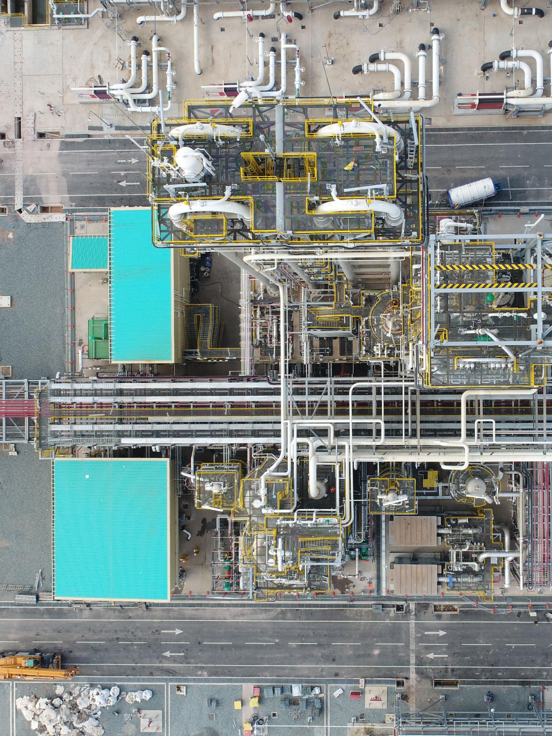
Maire is a multinational company operating in the field of engineering and chemical plant construction. With extensive experience and solid expertise in materials science, the group executes and manages complex projects for chemical plant construction. With the changes that have transformed markets, regulations and people's awareness of the problems related to the climate emergency in recent years, the company has felt the need to evolve its business by focusing on its technological dimension, to serve the energy transition.
This evolution in terms of business and organization required support through a transformation in branding and communication.
Result
To support Maire in this transformation process, we drew inspiration from the company's ability and experience in transforming matter, and we developed:
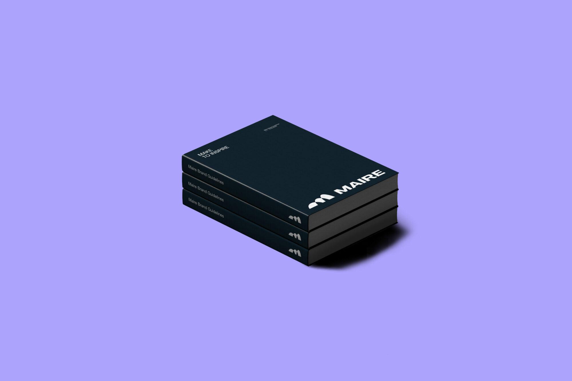
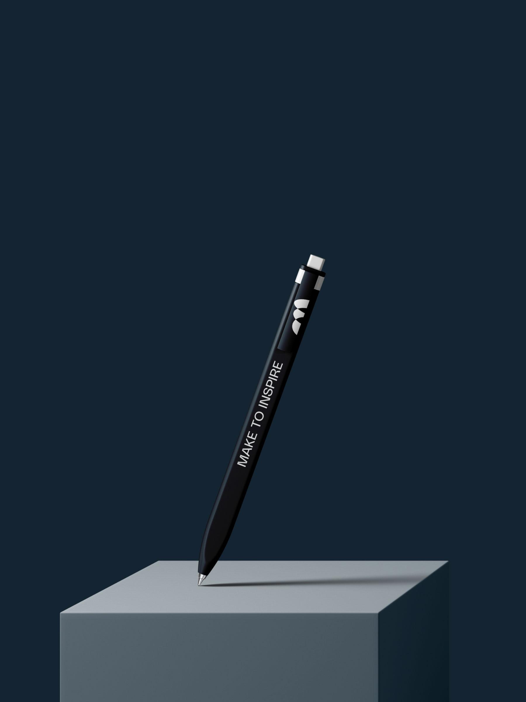
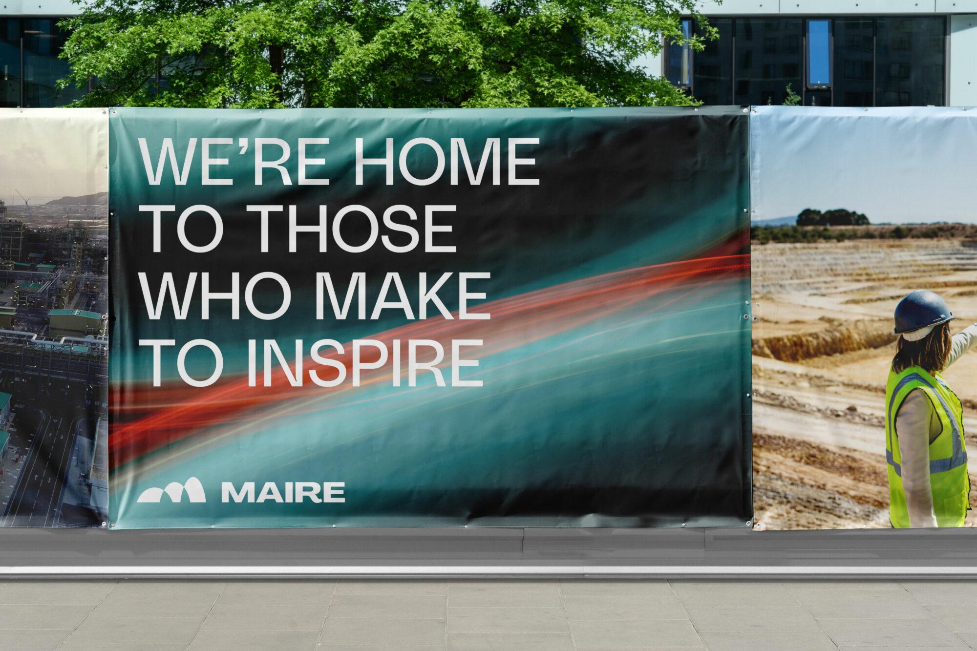
- a new brand narrative: the tagline “MAke to inspIRE” has given a new meaning to the name Maire and added a new strength to the company's purpose, which aims to inspire change through its capacity to create, build and design;
- a new brand architecture, enabling a clearer and more effective representation of the group's work;
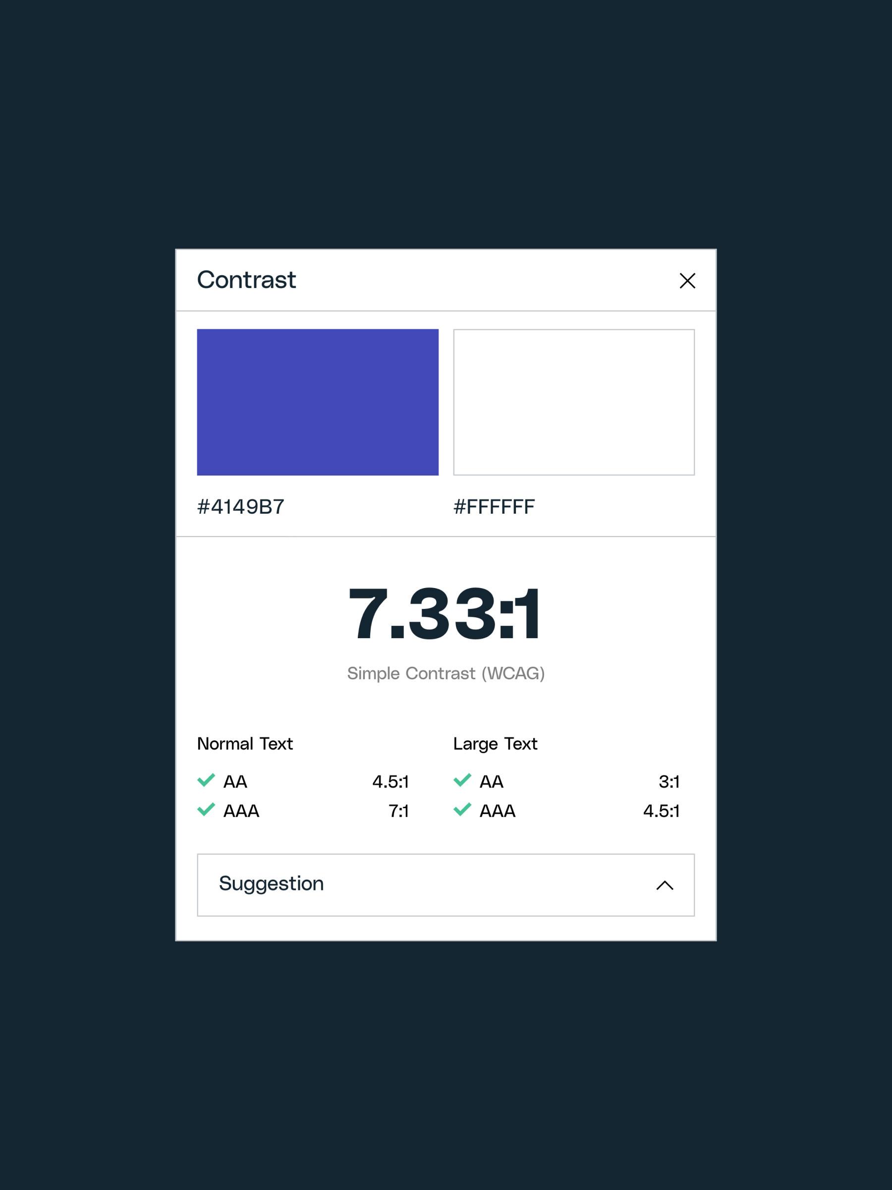
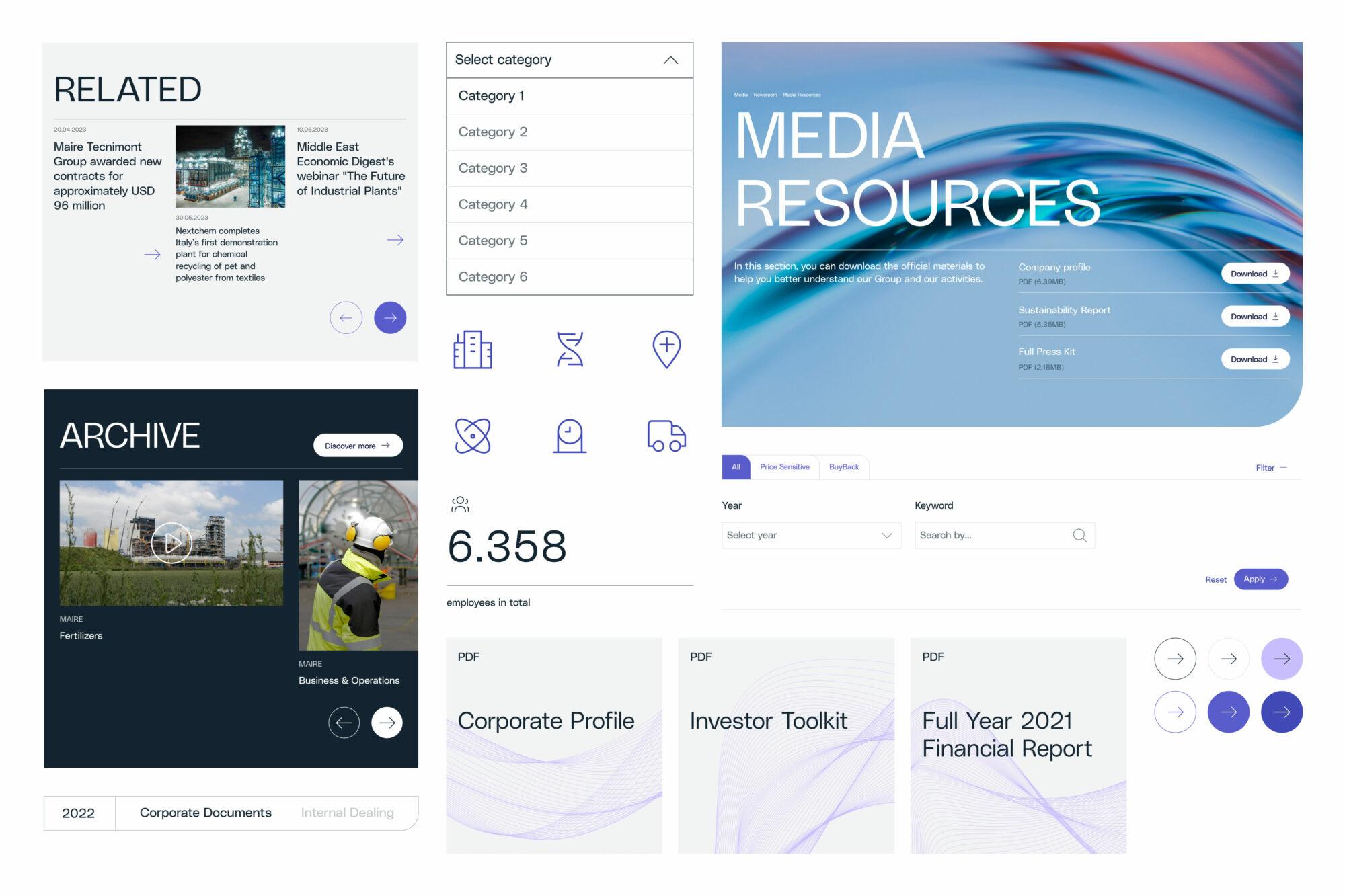
- a new visual identity inspired by concepts of strength, boldness and impact: light/dark contrast, prominent and distinctive typography and evocative and striking iconography;
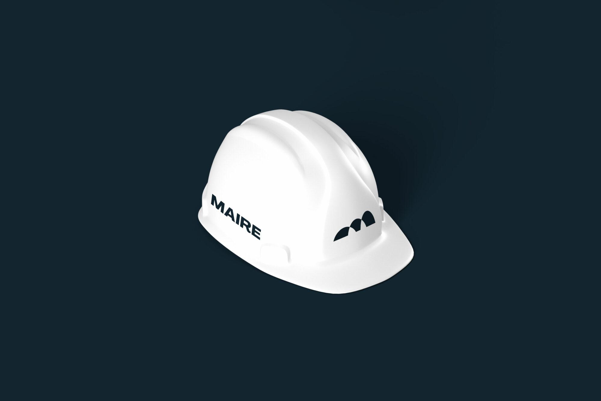
- a logo restyling in which the three arches have been translated into an open configuration, no longer converging at one point, to represent continuous evolution. The arches were given weight and body through a filling treatment, becoming three-dimensional, concrete and solid yet dynamic. They symbolize the three pillars of sustainable transformation: society, environment and industry;
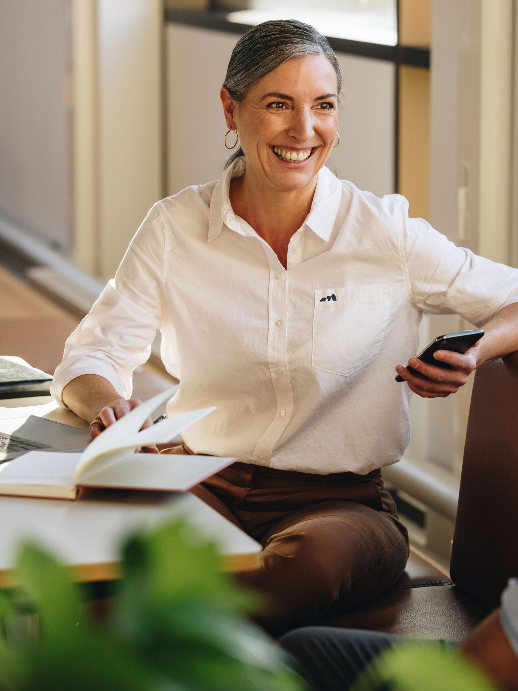
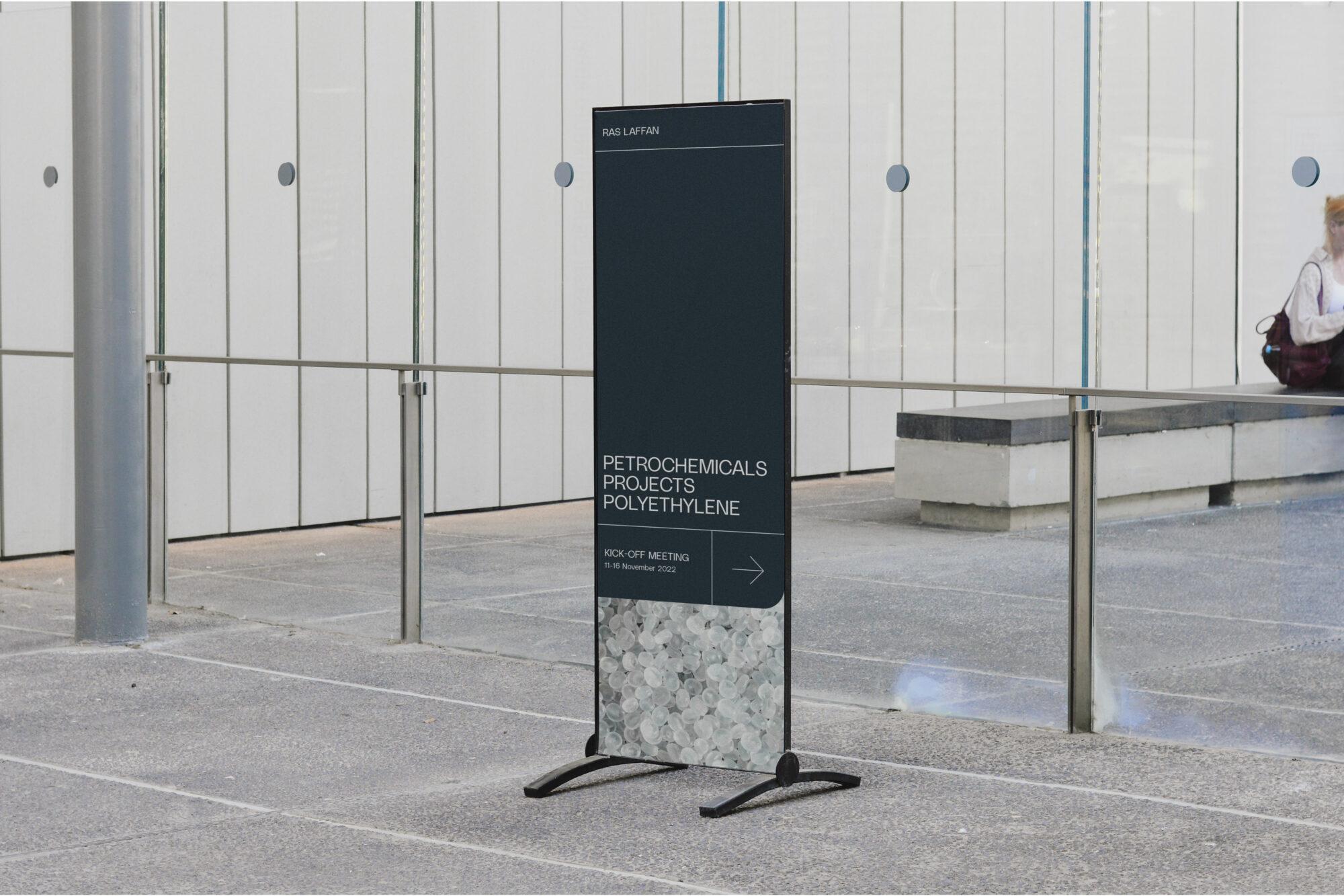
- the adaptation of the new brand across online and offline media;
- the new corporate website, making the contents more accessible, the brand’s story clearer and its identity more digital-oriented;
- the new websites of all the companies within the group.
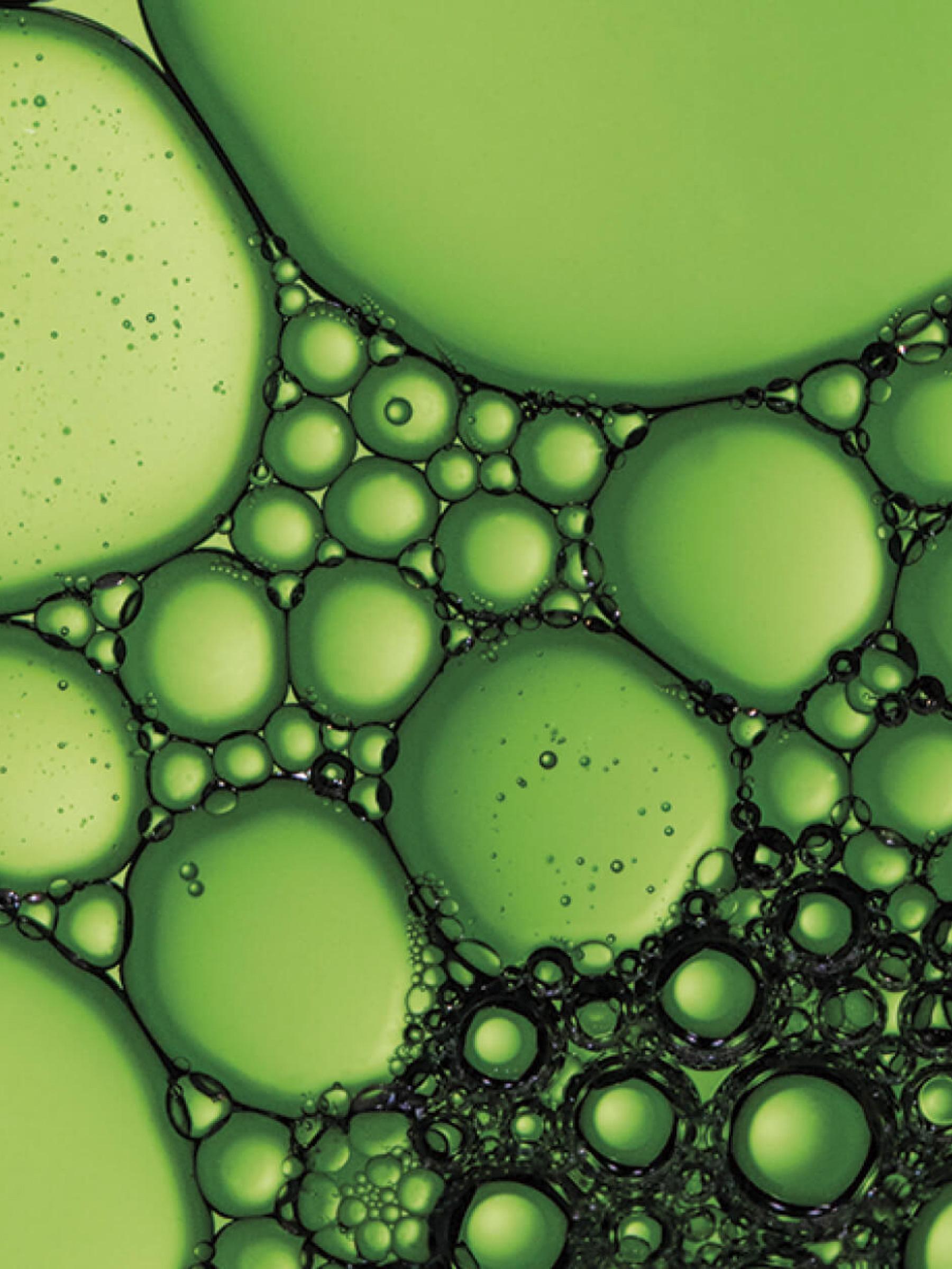
For the creation of the visual assets, we used the generative capacity of programming languages: just as Maire does, the generative processes start from something that exists and transform it into something new. In this way, the brand's visual identity deeply reflects Maire's purpose: putting the most advanced technologies at the service of people.
Inspire + Transform +Inspire + Transform +Inspire + Transform +
Let's work together
There’s no such thing as an impossible project.
Hit us up and let’s get to work.
—
©2004–25 Imille Srl Società Benefit
Viale Francesco Restelli 1, 20124 Milano
VAT: IT04198690960
SDI: A4707H7