GoBeyond the Responsible Innovation Platform
Client
Sisal
Industry
Entertaiment
Disciplines
Brand Positioning
Brand Narrative
Brand Identity
Motion Design
Print Design
Experience Design
Engineering
Take a look
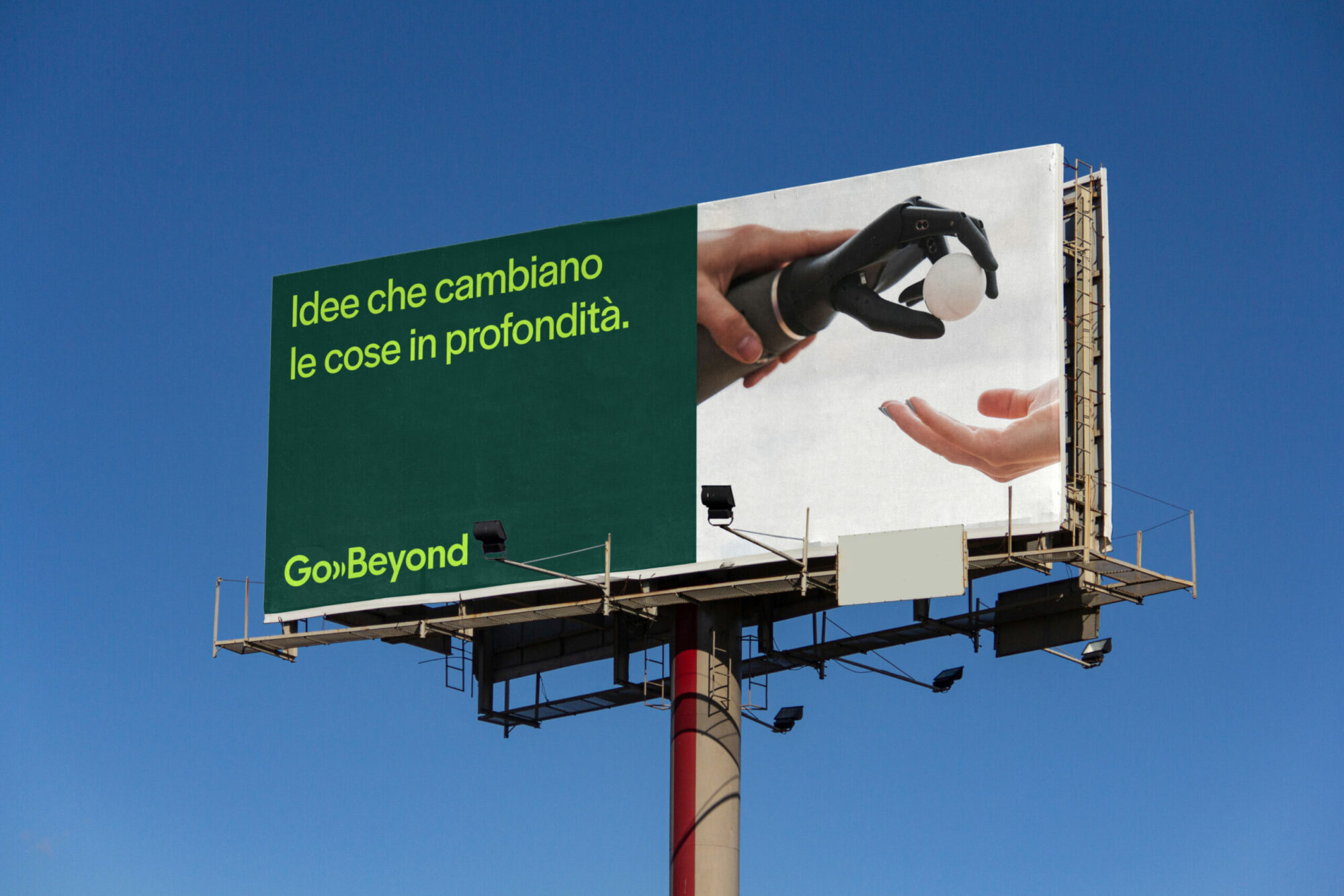
We helped Sisal transform the GoBeyond call for ideas into the first Italian platform for responsible innovation. We created a completely new brand identity (logo, colors, typography, illustration, storyline), and designed a new website to make the whole ecosystem created by GoBeyond around the call for ideas accessible: from training paths and a community for sharing ideas and experiences, to a magazine exploring the frontiers of innovation.
Challenge
From 2014 to 2021, the call for ideas promoted by Sisal has grown in numbers and ambitions to become one of the best-known and most participatory initiatives targeting startups in Italy. With the launch of the Academy training tracks and the creation of an increasingly structured community, GoBeyond set the goal of becoming a permanent program to support innovation. It was necessary to disengage the project from the idea of an occasional event, and anchor it in the concept of responsibility, also in line with Sisal's commitment to responsible gaming. GoBeyond was to promote and support responsible innovation: ideas and projects that can generate lasting impact and address the economic, social, and environmental challenges of our time.
Result
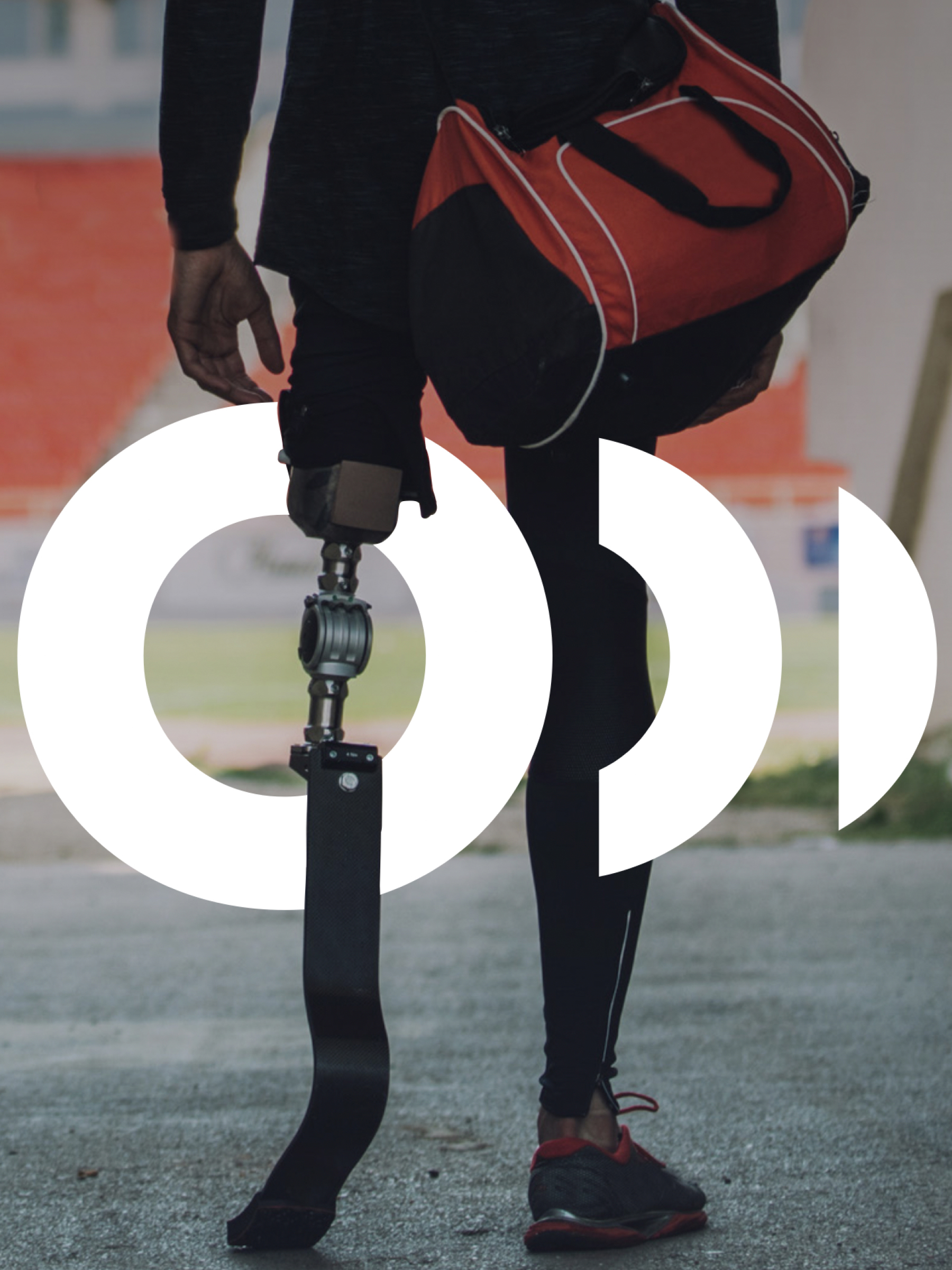
We designed the transformation of GoBeyond into an ecosystem for innovation, thus creating the first Italian platform for responsible innovation. We did this by designing a new visual identity, and by telling a new story, centered on the GoBeyonders: people who dedicate their lives to an idea, work to overcome problems, find solutions, and make in-depth changes. To visualize this story, we created: A logo inspired by the idea of expansion, forward movement, propagation of ideas that generate change. A monogram that can also be used independent of the logo, in which the letter O becomes a wave and symbolizes the power of innovation that spreads and generates impact. A flexible visual identity: the graphic treatment of the main logo was also applied to the logos identifying the different areas of the platform, thus building for each area a recognizable identity and at the same time consistent with the overall identity. A completely revamped site experience, in which the different environments of the GoBeyond ecosystem acquire equal importance and interact with each other in a dynamic way. A press campaign and video based on the recursive use of the monogram, which becomes a symbol of the ability to generate ever new ideas, and to pave the way for innovation. To build a more responsible future, a fairer and more sustainable world, as GoBeyond says, all that is needed is an idea capable of going beyond. It is a belief we share, and it is by trying to capture this spirit that we designed the identity and experience of the platform.


Inspire + Transform +Inspire + Transform +Inspire + Transform +
Let's work together
There’s no such thing as an impossible project.
Hit us up and let’s get to work.
—
©2004–25 Imille Srl Società Benefit
Viale Francesco Restelli 1, 20124 Milano
VAT: IT04198690960
SDI: A4707H7