Barilla Digital Ecosystem
Barilla Digital Ecosystem
Barilla Digital Ecosystem
CLIENT:
CLIENT:
Barilla Group
Barilla Group
SERVICE:
SERVICE:
Digital product
Digital product
Digital product
YEAR:
YEAR:
2024
2024

A global food company talks to two audiences that rarely meet. On one side, journalists, researchers, partners and employees who want to understand what the group stands for; on the other, chefs, restaurant owners and catering operators who need the right product for their kitchen, in their language, on their phone between one service and the next.
With Barilla, the Italian family company that has been bringing food to the world's tables since 1877, we designed two pillars of its digital presence: the corporate website of Barilla Group and Barilla for Professionals, the system of B2B websites dedicated to the HoReCa sector. Two projects with different goals, audiences and design systems, which still speak to each other through a shared heritage.
CHALLENGE
Barilla Group needed a corporate website able to drive awareness, engagement and advocacy around the topics that define its role in society. It had to inform strategic audiences, shape their perception of the group and bring coherence to corporate communication across every touchpoint.
Barilla for Professionals faced a different kind of complexity. Its digital presence was spread across ten websites built on different structures and platforms, two of them hosted as pages inside the Barilla consumer site, and none designed for mobile. Each market had its own product range, recipes, timelines and local contacts, and every local site depended on the global one.
How do you make a corporate website worth reading, and a network of country sites easy to run without flattening the differences between markets? For Barilla for Professionals, complexity was part of the brief. The task was to make it manageable: easy to explore for users, efficient to run for local teams, open to the exceptions each market brings.
CHALLENGE
Barilla Group needed a corporate website able to drive awareness, engagement and advocacy around the topics that define its role in society. It had to inform strategic audiences, shape their perception of the group and bring coherence to corporate communication across every touchpoint.
Barilla for Professionals faced a different kind of complexity. Its digital presence was spread across ten websites built on different structures and platforms, two of them hosted as pages inside the Barilla consumer site, and none designed for mobile. Each market had its own product range, recipes, timelines and local contacts, and every local site depended on the global one.
How do you make a corporate website worth reading, and a network of country sites easy to run without flattening the differences between markets? For Barilla for Professionals, complexity was part of the brief. The task was to make it manageable: easy to explore for users, efficient to run for local teams, open to the exceptions each market brings.
SOLUTION
We began with a principle that became the core of the content strategy: a corporate brand earns attention when it switches off the spotlight on itself and lets its actions speak. For Barilla Group, this meant moving corporate communication from producing content to crafting journalism, looking for the real story behind each initiative and the moments that bring it to life. From this principle, we developed:
A content strategy for Barilla Group. One brand voice defined by its tonality (open, genuine, inspirational) and four editorial principles: driven by story and guided by impact; one voice for brand, people, values and purpose; let actions speak for the company; quality over quantity. Dedicated guidelines extend the same voice to LinkedIn, YouTube and X.
An editorial framework built on three areas. Good for You, Good for the Communities and Good for the Planet gather the group's topics, from food as a positive daily habit and the Mediterranean diet to inclusion, workplace culture, sustainable agriculture and the environmental impact of its brands.
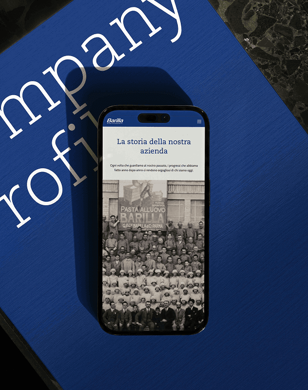
The Barilla Group corporate website. We designed the information architecture, navigation, user flows, interface, art direction and visual design, and developed the platform. Stories about food, sustainability, innovation and people lead the experience, while sections on the company, its commitment, its sustainability work and its brands give each story a place to land.
For Barilla for Professionals, the starting point was the opposite problem. The complexity of a multi-country B2B offer was there to stay, so we focused on making content easy to consult, inviting professionals to explore the range before they lose interest. Through a series of workshops with the client, organised around corporate pages, products and recipes, editorial content and homepage, we defined:
A design strategy built on three user interests. "Get Solutions" shows that the range has an answer for each type of business. "Get Inspired" uses recipes, cooking tips and foodservice highlights to spark curiosity about products and services. "Get in Touch" keeps the contact request visible from the menu and adds a dedicated banner to each section, with copy written for the page it sits on.
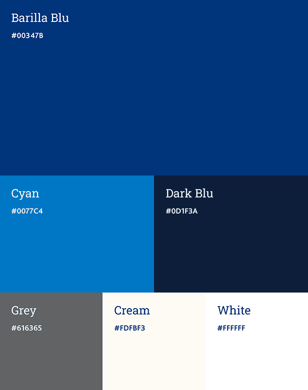
A look & feel rooted in the Barilla for Professionals identity. A deep, refined blue paired with red, close-up imagery of pasta textures and dishes, and a strong focus on the chefs and people who work in the sector. Netto Pro and Avenir set the typographic voice of a trusted partner: elegant and contemporary, with a traditional soul.
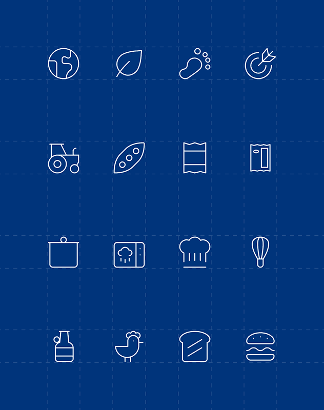
A design system and a shared architecture. Components and their states, product colour styles, content icons and a grid system that adapts across four breakpoints, from 320 to 1440 pixels. Every country site shares the same structure, and each market can adapt sections and content to its own needs.
A rollout model from global to local. We built a global master site, presented the project to each market, onboarded the regional teams and guided every country through content selection, translations, data migration, testing and go-live, so that each localisation grew from the same base without overlapping the others.
Today, Barilla Group tells its stories with one voice, and Barilla for Professionals reaches professional kitchens through eleven sites in six languages, from Stockholm to São Paulo to Sydney. Two systems, each with its own shape, made from the same dough.
SOLUTION
We began with a principle that became the core of the content strategy: a corporate brand earns attention when it switches off the spotlight on itself and lets its actions speak. For Barilla Group, this meant moving corporate communication from producing content to crafting journalism, looking for the real story behind each initiative and the moments that bring it to life. From this principle, we developed:
A content strategy for Barilla Group. One brand voice defined by its tonality (open, genuine, inspirational) and four editorial principles: driven by story and guided by impact; one voice for brand, people, values and purpose; let actions speak for the company; quality over quantity. Dedicated guidelines extend the same voice to LinkedIn, YouTube and X.
An editorial framework built on three areas. Good for You, Good for the Communities and Good for the Planet gather the group's topics, from food as a positive daily habit and the Mediterranean diet to inclusion, workplace culture, sustainable agriculture and the environmental impact of its brands.
The Barilla Group corporate website. We designed the information architecture, navigation, user flows, interface, art direction and visual design, and developed the platform. Stories about food, sustainability, innovation and people lead the experience, while sections on the company, its commitment, its sustainability work and its brands give each story a place to land.
For Barilla for Professionals, the starting point was the opposite problem. The complexity of a multi-country B2B offer was there to stay, so we focused on making content easy to consult, inviting professionals to explore the range before they lose interest. Through a series of workshops with the client, organised around corporate pages, products and recipes, editorial content and homepage, we defined:
A design strategy built on three user interests. "Get Solutions" shows that the range has an answer for each type of business. "Get Inspired" uses recipes, cooking tips and foodservice highlights to spark curiosity about products and services. "Get in Touch" keeps the contact request visible from the menu and adds a dedicated banner to each section, with copy written for the page it sits on.
A look & feel rooted in the Barilla for Professionals identity. A deep, refined blue paired with red, close-up imagery of pasta textures and dishes, and a strong focus on the chefs and people who work in the sector. Netto Pro and Avenir set the typographic voice of a trusted partner: elegant and contemporary, with a traditional soul.
A design system and a shared architecture. Components and their states, product colour styles, content icons and a grid system that adapts across four breakpoints, from 320 to 1440 pixels. Every country site shares the same structure, and each market can adapt sections and content to its own needs.
A rollout model from global to local. We built a global master site, presented the project to each market, onboarded the regional teams and guided every country through content selection, translations, data migration, testing and go-live, so that each localisation grew from the same base without overlapping the others.
Today, Barilla Group tells its stories with one voice, and Barilla for Professionals reaches professional kitchens through eleven sites in six languages, from Stockholm to São Paulo to Sydney. Two systems, each with its own shape, made from the same dough.






OTHER WORKS
S.2]

G-Shock
An Unbreakable Icon
G-Shock
An Unbreakable Icon
G-Shock
An Unbreakable Icon

Ministero dell'Ambiente e della Sicurezza energetica
Al pianeta teniamo un mondo
Ministero dell'Ambiente e della Sicurezza energetica
Al pianeta teniamo un mondo
Ministero dell'Ambiente e della Sicurezza energetica
Al pianeta teniamo un mondo
Edenred
The Edenred Show
Edenred
The Edenred Show
Edenred
The Edenred Show

Pan di Stelle
Pan di Stelle
Pan di Stelle
Pan di Stelle
Pan di Stelle