The ABC guide to be (consciously) cognitive-biased by brands
A for Ancient Brain
https://cdn.embedly.com/widgets/media.html?src=https%3A%2F%2Fplayer.vimeo.com%2Fvideo%2F337375595%3Fapp_id%3D122963&dntp=1&url=https%3A%2F%2Fvimeo.com%2F337375595&image=https%3A%2F%2Fi.vimeocdn.com%2Fvideo%2F784461655_1280.jpg&key=a19fcc184b9711e1b4764040d3dc5c07&type=text%2Fhtml&schema=vimeo
Omg look at this! Isn’t it amazing?
We can all agree, this installation is superb.
But why are we completely fascinated by this video? And why has
Hyundai decided to do such a different experience that has nothing
to do with an automotive brand?
The answer is…“Memorability”.
All thanks to the old brain.
Wait! What do you mean with “old brain”?
Let’s start from the beginning. So the story tells that we basically have a brain (of course!) that is made up of 3 different brains developed during the human evolutionary history.
The oldest and first one, also called reptilian brain, deals with our survival instincts and, therefore, pays constant attention to the stimuli that surround us: food, sex, life protection… these instincts are all connected to our most unconscious and automatic responses. And when your unconscious connects the qualities of softness and brightness to food, it’s Game Over.
In other words, our mind works like this.
These images have a bizarre sense of fatness (and yes it’s normal that you want to touch it so bad) this is linked to food because food has a volume which is generally round and fatty. Our mind, over the centuries, has learned to recognize and associate useful stimuli for survival.
So, round, bright and colorful volumes are a visual pleasure for our mind because they remind us of food, which is essential for our life and for sure we will remember it.
Now quickly look at these two images:

Which one do you prefer?
I bet the second one. Did I get it right?
It’s our old brain’s fault.
In fact, the old brain is also responsible for the weird sense of dissonance that we experience when we look quickly at the first image. In the first image, the fork is not in the position in which we usually find forks when we sit down to eat.
So please remember that if you want to show an image of a product, be careful to always orient it in the “sense of use”. In this way, you will immediately activate the instinct to use it from the point of view of the consumer who sees it.
If we want to sum up what we have said so far, we can say that a great part (70%) of what happens in our mind is outside our awareness and our instinctive side plays a crucial role in what concerns decision making. Every second, our senses collect around 11 million micro information from the world around us; only 40 of these are processed by our conscious part. We consider ourselves to be rational beings, that make rational decisions,
but we are not.
A quote from David Ogilvy that I read some years ago has stayed with me:
“The problem with marketing research is that people don’t realize their emotions, they don’t say what they think and they don’t do what they say”.
To know the mechanisms regulating our brain is essential to foresee how to convey a written or visual message in the most effective way.
B for Bias, cognitive bias
Would you ever trust perfect strangers?
Or would you ever just choose a product by his package?
In real life, of course not.
But the answer changes on the web.
We are so used to consulting the reviews of perfect strangers for everything:
That new restaurant I saw on the street — oh yes let me check on TripAdvisor;
That new series on Netflix — oh yes let’s ask for comments on Instagram
That amazing flat in Paris — oh yes but… would you ever book it without having read the guests’ comments on Airbnb?
Social proof is so strong in the digital era.
Going back in time, in the 70s Kahneman and Tversky started to use the definition “cognitive bias” for the first time to describe the way in which innate prejudices interfere and erroneously influences the interpretation of reality.
Bias acts like mental shortcuts, indeed, and the Social Proof is one of the most important.
A bias that does not only affect our purchasing decisions, but also other behaviors such as the way we visit a website. A very popular video could push us to watch it, same with influencers.
https://cdn.embedly.com/widgets/media.html?src=https%3A%2F%2Fwww.youtube.com%2Fembed%2FDYlesHOaPkY%3Ffeature%3Doembed&url=https%3A%2F%2Fwww.youtube.com%2Fwatch%3Fv%3DDYlesHOaPkY&image=https%3A%2F%2Fi.ytimg.com%2Fvi%2FDYlesHOaPkY%2Fhqdefault.jpg&key=a19fcc184b9711e1b4764040d3dc5c07&type=text%2Fhtml&schema=youtube101 mln of subscribers and 3,4 mln of views after a day of uploading a new video 😱
Follow others? No, I am rational!
Without being aware of it, evaluations and reviews activate our need for social validation, but they also provide us the rational motivations we need to justify our decisions. Data, graphics, statistics allow us to tell ourselves that we have made the correct choice.

In fact, the addition of statistics gives a sort of authoritativeness to what we are reading and, in the same way, it gratifies us with a rational image of ourselves that could nourish our Confirmation Bias, or the tendency to search, interpret and pay attention only to the information that confirms our preconceptions.
Well, the third option seems like the best one:
I can do an annual plan, pay monthly and use all the applications of the Creative Cloud (60,99 €/month is not so much if you think that 24,39 € is only for one app of the Creative Cloud).
And guess what…that offer is also the one highlighted and suggested. 😏
Moving forward, on a website it’s also important to communicate information in the most appropriate context with the choice you would like your user to make. When this happens, Framing Effect occurs, and we tend to choose based on the context in which an option is formulated to us, not based on its real value.
With the products is quite easy: less expense or more product? Even if the total advantage is the same we prefer the option that makes us believe that we have achieved more.
But when our brain has no references, it starts to generate a judgment based on the nearest information.
Madams and monsieurs, let me introduce you to the Anchor Effect.

Some years ago, during the Fashion Week, Ikea came up with this interesting post:

How strong and immediate is the comparison between the exaggerated costs of the catwalk dresses with the ridiculous one of an Ikea shower curtain, which seems much less expensive.
Thanks to the Anchoring technique, it’s also possible to make some concepts more concrete and then…irony does the rest.
Have you ever wondered why for so many years in the Google search bar next to the button “Search with Google” there was the button “I feel lucky”?
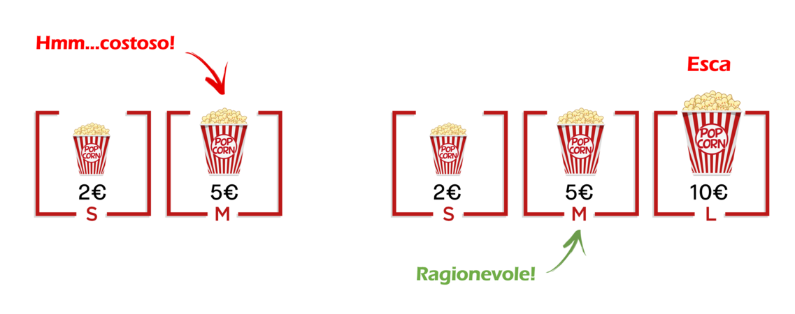
After all, that option was meant to be used, its purpose was to increase the perceived value of the button beside it. We call this Decoy Effect and it occurs when we tend to modify our perception about 2 options when a third option that seems useless or obviously disadvantageous is presented.
Online it’s something like this:

Offline, more like this:

We always hear about the Less is more Theory: when you this apply to design it works so well.
But do you know why? Barry Schwartz could give us an answer.
He called it the Paradox of Choice that basically means that when our brain is faced with a lot of information, it gets overwhelmed and is unable to choose even one information.
On the web, for example, this means that if we don’t want to confuse our user, we need to reduce the number of menu label to a maximum of 6.
Uber, for instance, has a great subscription process: the formula for this perfect experience?
The process is fully Distraction Free and the focus is super high on what you have to do (because it’s the only thing that you can find on the page 😂)
Last but not least, let’s take a look at one of my favorite references: Booking.com

With more than a thousand A/B tests on the website each day, Booking.com is a magician that knows the art of Urgency (Booked 7 times for your dates in the last 24h), Scarcity Bias (Only 5 rooms left!) and Loss Aversion (You missed it!).
C for Create Value
Considering the scenario above, it seems that we have little freedom on the web and marketers and designer could manipulate us at any given moment.
But what they really want to do is bridge the gap between the value of a product or a service and its perception.
Nowadays, attention is the new currency and companies try to be equipped to be memorable. This is because, for us, memorable is still what creates value.
We trust people, brands and services that create something meaningful for us.
The bad news is that we can’t free ourselves from cognitive bias, this is our inner luggage.
The good news is that now that you know this you can use it wisely to add value to your brand.
